Descriptions by Jason Jones, James Fabiano and TheLogoFan2004
Captures by Eric S., Logophile, Mr.Logo, naxo-ole, Sagan Blob, Gilblitz112, TimYeiLogoCollector, SubparMario63 and Edc4
Editions by Eric S., V of Doom, Logophile, CBS/FoxKid999, Chowchillah, Shadeed A. Kelly, bmasters9, Lee Cremeans, PluMGMK, Kramden II, Edc4 TheLogoFan2004, Trevor807, and Tjdrum2000
Video captures courtesy of Peakpasha, WaluigiN64HD, Logo Archive, Sagan Blob Enterprises, mulog29, Avdhesh Mystry. vhsclassic90s and Edc4
Background
Columbia Pictures Industries, Inc. is an American film studio and production company owned by the Sony Pictures Motion Picture Group, a division of Sony Pictures Entertainment, and one of the major American film studios. Since 1993, it has been headquartered at Sony Pictures Studios (formerly MGM Studios and the former Lorimar's studios) in Culver City, California.
Columbia Pictures was originally founded as "Cohn-Brandt-Cohn Film Sales" in 1918 by Harry Cohn, his brother Jack Cohn, and Jack's friend Joe Brandt. Brandt was president of CBC Film Sales, handling sales, marketing and distribution from New York along with Jack Cohn, while Harry Cohn ran production in Hollywood. Many of the studio's early productions were low-budget affairs; the start-up CBC leased space in a poverty row studio on Hollywood's Gower Street. Among Hollywood's elite, CBC's reputation led some to joke that "CBC" stood for "Corned Beef and Cabbage".
Following a reorganization, the Cohn brothers renamed the predecessor company as "Columbia Pictures Corporation" on January 10, 1924. Columbia's product line consisted mostly of moderately budgeted features and a short-subject program of comedies, serials, cartoons, and sports films. Columbia gradually moved into the production of higher-budget fare, building a reputation as one of Hollywood's more important studios. On December 23, 1968, it was reorganized as Columbia Pictures Industries after merging with its television division Screen Gems. On June 22, 1982, Columbia Pictures was sold to The Coca-Cola Company for $750 million. In December 1987, it became part of Columbia Pictures Entertainment, with Coke owning 49%. Finally, on November 8, 1989, it was sold to Sony Corporation of Japan. Since 1998, Columbia Pictures has been part of the Columbia TriStar Motion Picture Group (Sony Pictures Entertainment Motion Picture Group since 2013), which is a division of Sony Pictures Entertainment, a subsidiary of Sony.
Columbia Pictures titles were distributed through a partnership with Warner Bros. under the name Columbia-Warner internationally (with some partnerships in the United Kingdom) until 1987, when Columbia reorganized its international distribution division into Columbia Tri-Star Films. The UK partnership would last until 1988.
This logo is currently missing in action. Please do not add reconstructions of the logo if any exist, as they are likely not accurate to the actual logo. Additionally, do not attempt to add a finalized description of the logo until it has been found in its entirety.
Textless variant
Visuals: On a dark gray background with arch clouds below, there is a woman dressed in a Roman soldier's outfit (similar to the ancient Greco-Roman goddess Athena/Minerva), crowned with a wreath and covered in a toga, holding a shield in her left hand and holding an olive branch in her right hand. There is the text "COLUMBIA PICTURES CORPORATION Presents", with "COLUMBIA PICTURES" arched above, "CORPORATION" underneath it in a straight line, and "Presents" below.
Trivia:
The figure depicted in the logo is actually of the goddess Liberty (or the Roman goddess Libertas) as seen on the obverse of the "Standing Liberty quarter", which was minted from 1916 until 1930.
The identity of the model is disputed. The most known candidate for the model is Doris Doscher, an actress who sometimes worked in silent films under the name Doris Doree, and who became known as "the girl on the quarter". However, some reports stated that Broadway actress Irene MacDowell was the model. There are some speculations that the model could actually be a composite of both women.
Variant: A textless variant exists.
Technique: This logo is a matte painting.
Audio: None.
Availability: Seen on silent-era Columbia Pictures films, most of which are now lost or survive only in an incomplete form.
The following silent-era films from Columbia released during the timeline of this logo are known to be complete: Pal o' Mine, The Midnight Express, The Price She Paid, One Glorious Night, Tainted Money, Who Cares, Charley's Aunt, An Enemy of Men, The Unwritten Law. The Price of Success, The New Champion, The Great Sensation, When Husbands Flirt, A Fight to the Finish, S.O.S. Perils of the Sea, The Fate of a Flirt, The Lure of the Wild, Ladies of Leisure (1926), The Belle of Broadway, The Lone Wolf Returns, When the Wife's Away, Obey the Law, The Better Way, Wandering Girls, The Bachelor's Baby, The Price of Honor, Birds of Prey, Paying the Price, Pleasure Before Business, Poor Girls, Rich Men's Sons, The Romantic Age, The Blood Ship, For Ladies Only, Alias the Lone Wolf, The Clown, The Tigress, The Opening Night, The Warning, and The College Hero. Prints of these films are held in various film libraries, including the George Eastman House and the Library of Congress.
It has appeared in the 1999 documentary The Lady with the Torch.
This logo also appeared in the 2018 film Spider-Man: Into the Spider-Verse as part of that film's variant of the 1993 logo.
2nd Logo (January 1, 1928-May 25, 1936)
Earlier variant
Colorized version
Textless variant
Textless colorized variant
Closing variant
Earlier closing variant
Colorized closing variant
Visuals:
1928-1932: There is a medium shot of a lady holding a light torch in her right hand, depicted with a dark bob and a Cleopatra-esque headdress across her forehead. She is draped in an American flag complete with the stars on her left shoulder and the stripes coming across her middle, supported by her left arm, and hanging down her right side. Her torch is displayed with a rather primitive, flickering style of animation emitting lines of light as rays. The Torch Lady's head is under an arch of chiseled, square-shaped letters reading the words "COLUMBIA PICTURES CORPORATION".
1932-1936: Same as before, but the words are replaced with "A COLUMBIA PRODUCTION" and the typeface is different.
Trivia: The Torch Lady shown here is actress Claudia Dell, who appeared as Spanky's mother in the Our Gang shorts "Mama's Little Pirate" and "Anniversary Trouble".
Variants:
Sometimes, only the print logo would be present on screen.
On some Three Stooges shorts, the logo is shown without the company name.
A rare opening variation has the words "COLUMBIA PICTURES" on top and "Presents" below. It was spotted on The Pagan Lady, The Guilty Generation, The Deadline, The Secret Witness, and the early John Wayne film Maker of Men (all 1931).
In 2004, Columbia TriStar Home Entertainment released several colorized Three Stooges shorts; these had the Torch Lady in color as well, and the words are in yellow.
Closing Variants:
Same as before, but the words are "THIS IS A COLUMBIA PICTURE" with "The End" below it in a script font.
In an earlier variant, the words are replaced with "A COLUMBIA PRODUCTION." It was spotted on The Miracle Woman, Platinum Blonde, Three Wise Girls, The Final Edition, High Speed, American Madness, and the Three Stooges short "Restless Knights".
On That Certain Thing, there is a print logo with the words "The End" overlapping the print logo in a script font.
Some films from 1928 to 1932 have the print logo at the center with the words "The on the left and "End" on the right.
There is another closing variant that has the words "COLUMBIA PICTURES", with "The End" appearing below, which can be found at the end of The Secret Witness, Maker of Men, Forbidden, and Shopworn.
Technique: A mix of a matte painting, moiré effects and editing.
Audio: A majestic horn sounder (a la 20th Century Fox), or the opening/closing theme of the short/feature.
Availability: Seen on Columbia-owned films from this time period right up until the introduction of the next logo.
The logo premiered on That Certain Thing and made its final appearance on Counterfeit.
It was seen on It Happened One Night (1934) and Mr. Deeds Goes To Town (1936).
It can also be seen on The Three Stooges releases on DVD.
It can also still be seen on reruns of 1934-1936 Three Stooges shorts on IFC, AMC, and Antenna TV.
It can also be found on TCM and Sony Movie Channel as well.
It does not appear on original prints of Walt Disney's Mickey Mouse and Silly Symphonies cartoons from 1930-1932, as Columbia only distributed those shorts.
The textless version can be seen on some Three Stooges shorts.
Visuals: There is the lady, this time standing on top of a pedestal with a backdrop of clouds over her, while she is holding her light torch. Much more refined, ethereal and goddess-like, her facial features are less pronounced and she looks away (up and to the right) instead of straight ahead. Her headdress is absent and her hair sweeps back instead of hanging by the sides of her face. The drape over her shoulder is less obviously an American flag, with the stars on the left shoulder being toned down in a shadow, and the stripes are visible only on the portion of the drape hanging down her right side. "A COLUMBIA PRODUCTION" is replaced with the tall chiseled letters of "COLUMBIA" (which fades in a second afterward) running straight across the top section of the screen, with the lady's torch glowing in front of the "U". A new form of animation is used on the logo as well, with a torch that radiates light instead of flickers. Until the mid-1960s, this logo would also appear at the end of films, sometimes with the words "The End" in a script font.
Trivia: The model in this and the next two logos is Pittsburgh native Jane Chester Bartholomew, who was discovered by Columbia co-founder and head Harry Cohn. After she left acting in the 1960s, Bartholomew became a nursing inspector with the Chicago Board of Health. She died in 2012.
Byline: Starting in 1974, the byline "A DIVISION OF COLUMBIA PICTURES INDUSTRIES, INC." appears at the bottom of the screen. This variant was introduced around the time its television production division Screen Gems Television changed its name to Columbia Pictures Television.
Evolution Variants:
1942: The lady looks much like she did in 1936, but the flag is now a plain red mantle (the Sony website implies that the change was to coincide with a new law that forbade the usage of the American flag as clothing; perhaps not coincidentally, this variation first appeared within a year of the United States' entry into World War II), dark on the left shoulder with only the shadows of the folds distinguishing the rest of it from the lady's white gown on her right side. The "COLUMBIA" lettering is also modified, still chiseled but less bold, and with darker shadowing.
1943 (1): The logo is adapted for Technicolor. The pedestal is more visible now and the sky background is different. It made its debut on The Desperadoes (1943).
1943 (2): Similar to the Technicolor variant, but the "COLUMBIA" text is orange, and the clouds and lady are a bit different. This logo is adapted for Cinecolor, as well as the Technicolor process.
July 17, 1953: The Columbia Lady's robe is redrawn with a plunging neckline. The logo is also adapted for widescreen. After the introduction of the next three variants, it would be used in tandem with them until it was retired.
January 26, 1955: The logo is adapted for CinemaScope. The Torch Lady loses her slipper-clad foot peeking out from the bottom of her robe as it divides just above the pedestal. Also, the clouds behind the logo are more concentrated in the center and more billowy in shape.
August 12, 1956: Similar to the CinemaScope variant, albeit in 4:3 fullscreen; more of the logo can be seen on the top and bottom. This logo is adapted for the 1.37:1 "academy" process, as well as the CinemaScope process.
1960-1968: Similar to the CinemaScope variant, but the clouds are blue.
April 1968-August 1, 1976: The drapery is temporarily pink during this era. Several films that feature this variant include Where Angels Go, Trouble Follows!, The Swimmer, The Big Gundown, Hammerhead, Funny Girl, The Wrecking Crew, Otley, Model Shop, MacKenna's Gold, Easy Rider, Castle Keep, Bob & Carol & Ted & Alice, The Desperados, Cactus Flower, Five Easy Pieces, The Owl and the Pussycat, The Reckoning, 10 Rillington Place, The Anderson Tapes, Dollars ($), The Horsemen, Brian's Song, Nicholas and Alexandra, A Day in the Death of Joe Egg, Butterflies Are Free, Fat City, The New Centurions, Monty Python's And Now for Something Completely Different, The Valachi Papers, 1776, The National Health, Lost Horizon (1973), The Way We Were, Summer Wishes, Winter Dreams, The Last Detail, The Golden Voyage of Sinbad, Tommy, and Brian De Palma's Obsession.
Variants:
On The King Steps Out, the Three Stooges short "Disorder in the Court" and the 1936 western Stampede, "PRESENTS" appears below.
On The Three Stooges shorts & other short subjects from 1940-1945, the 1936 (or 1942) Torch Lady appears on the left side of The Three Stooges or the short subject's title card. On the steps are the words "COLUMBIA" on top, "SHORT SUBJECT" in the middle, and "PRESENTATION" on the bottom step.
On Taxi Driver, the logo is on a black background with blue clouds and has all of the text appearing at the same time.
On some films or shorts subjects like The Three Stooges, Buster Keaton or Charley Chase, the logo is completely still, only the torch shining at the opening or at the end of the movie or shorts.
On the 1948 Three Stooges short "Fuelin' Around", the 1968 logo in black & white is seen at the beginning. Obviously, this plastered the Screen Gems logo on some TV prints, with/without the original music. This variant was seen on said short when reran on The Family Channel in the mid-1990s.
Prior to open matte, the logo sometimes has black bars on all four sides.
On 3D movies produced by the company, a 3D version of this logo was employed. The depth was as follows: the Torch Lady was closest to the screen, with "COLUMBIA" slightly behind her, and the cloud background farthest back.
An ending variant was used on serials in the 1930s and 1940s. Along the bottom, it would read "A Columbia Serial" along the bottom. These were used on the Batman serials, among others.
Two ending variants existed for short subjects during the early 1940s: (1) Near the top of the screen, "THE" is in a 3D-like Futura font with a white face and dark/light shadows to the left of the Torch Lady, and "END" in the same font and effects is to the right; the shadows from "THE END" go behind the Torch Lady to an unknown vanishing point behind the rays of her torch (much like the early-to-mid-60's Four Star Television logo's effect). Near the top of the Torch Lady's pedestal, "COLUMBIA" is in a small but wider version of the company name's "chiseled" font, and "SHORT" "SUBJECT" "PRESENTATION" is chiseled onto each step of the pedestal, going from top to bottom respectively (when seen on colorized prints of The Three Stooges, "THE" "END" and "COLUMBIA" are in a yellowish-gold color, and the clouds and shadows are shades of dark and light blue, respectively); and (2) the standard "The End" additional text below would read "A Columbia Short Subject Presentation". These variants are usually seen on The Three Stooges shorts and often accompanies the aforementioned title card variant.
An Italian version of the closing version was shown at the end of the Spanish Mexican film Él (aka This Strange Passion or Lui).
Two Soviet-Russian variants exist where the whole logo is a recreated painting, which varies, the "COLUMBIA" text is completely absent, and different text can be seen in front of the Torch Lady.
On a Super 8mm colorized print of the Krazy Kat cartoon "The Katnips of 1940", a copyright disclaimer was superimposed into the logo, reading:
Technique: Traditional animation for the torch rays, and a matte painting for the Torch Lady, text and backdrop.
Audio: Usually, the beginning/end of the movie plays over the logo. On some films, the logo appears completely silent. However, on several mid to late '30s Three Stooges shorts, it has a majestic theme before playing the Three Stooges theme. On several other films, it would have a different theme.
Availability: Can still be seen on Columbia Pictures films of this period on home video formats and on TV airings.
The last films to feature this logo were Taxi Driver, Drive-In, Harry and Walter Go to New York, Obsession (at least on U.S. prints), and Peter Bogdanovich's Nickelodeon.
The 1973 variation was also seen on some later struck 16mm prints of some Three Stooges shorts, sometimes plastering the Screen Gems logo with the latter logo's music sometimes preserved, with Tricky Dicks and Three Pests in a Mess being common examples.
Tommy originally featured the 1968-76 variation of the logo, but was plastered with the next logo below on all later prints and home video releases of the film. Monty Python's And Now for Something Completely Different suffered the same fate as Tommy on the video releases, but has been restored on the DVD releases.
This was seen on early releases of the 1975 version of The Stepford Wives, but when Viacom bought the rights to the film, along with the rest of the Palomar Pictures catalog in the mid-'80s, the logo was deleted. However, following the release of the 2004 remake, Paramount Pictures gained rights to the original film through Viacom (owner of the former company), and added their 2002 logo at the beginning of all current prints.
This also appears on current prints of films that originally had the 2nd logo, including Dirigible, Behind the Mask, Shopworn, The Circus Queen Murder, Man's Castle, Twentieth Century, The Whole Town's Talking, The Black Room (1935), and She Married Her Boss.
The "A Columbia Serial" variant can be seen on the old Batman serials when aired on TCM.
The 3D version appears on the company's Golden Age 3D features, including Man in the Dark, Miss Sadie Thompson, and The Mad Magician.
The Three Stooges shorts that include the "Short Subject" variants will likely be retained, being followed by the Sony Pictures Television logo.
The 1960 variant of this logo also appears at the start of the Warner Archive Collection 2023 Blu-ray release of Hey There, It's Yogi Bear! (1964).
Legacy: Considered the most well-known version of the logo, being used for an amazing 40 years.
4th Logo (June 23, 1976-February 11, 1982)
The Torch Lady
The sunburst
USSR snipe
Visuals: It begins with the familiar Columbia Torch Lady (a less-detailed yellow-toned 1942/1955 Torch Lady), standing on the pedestal holding her light torch against the backdrop of clouds. Then, the picture moves upward and towards the torch as the rays pull in, which shines even more as the picture blurs around it. It then emits a flash that fills the screen. When the flash dissolves, the light torch itself appears, as if in a sunburst, against a black screen and as it shrinks, it changes into a more "abstract" torch: a blue half circle, or a semicircle, with thirteen white light rays in the center and the words "Columbia Pictures" in a beveled Souvenir Bold font under it. The entire logo then slowly backs away as it fades out.
Trivia:
The Sunburst logo originally came out in 1975, but first appeared only on posters.
The animation for the Sunburst logo was provided by Robert Abel and Associates, who specialized in elaborate, motion-controlled animation and lighting effects, and also did work on commercials (early 1970s 7-Up ads among many others) and Star Trek: The Motion Picture.
Variants:
When viewed in 4:3 fullscreen, there are varying versions where we see the pedestal, including close and medium views. There is a far view version in either 1.85:1 on the U.S. Blu-ray release of Tommy or 1.37:1 "academy" ratio on 4:3 HD fullscreen prints of Tommy, Fun with Dick and Jane (1977) and Close Encounters of the Third Kind (the latter film shot in CinemaScope).
A Soviet version exists. Here, the sunburst glows and the text is pinkish-white for the finished product. This is most likely due to a mastering error, which was common among imported films at the time.
Many USSR releases used a snipe, if the logo described above is not used at all.
Technique: Motion-controlled cel animation, with the Torch Lady and cloud backdrop being a matte painting.
Audio:
June 23, 1976-June 20, 1980: It begins with a dramatic theme that builds up as the camera zooms in on the torch, and with the flash/sunburst, it takes an inspirational, majestic tone. This theme was composed by Suzanne Ciani.
July 11, 1980-May 15, 1981: None or the opening theme to the movie.
Audio Trivia: The main instruments appearing on the soundtrack were a small horn section, Suzanne Ciani's Buchla modular (for the "popping" effects) and an ARP string synth (the same model Gary Wright used for his song "Dream Weaver" around the same time).
Audio Variant: The USSR version has an announcer dubbed in.
Availability: Sony generally retains older logos for newer releases of Columbia's films much more often than their TV output. In the early days of Columbia Pictures' video division, however, this logo would be plastered by their home video logo (although the "Columbia Pictures" text alone would be seen for a split second, possibly due to poor editing). Otherwise, all later video releases, DVD and Blu-ray releases, and TV broadcasts retain this logo.
The first film to use this logo was Murder by Death, while the last film to use it were Happy Birthday to Me. However, in international territories, it was used until at least 1982 as this appeared on Death Wish II (released domestically by Filmways Pictures).
On some airings of The Mirror Crack'd (the 1980 Angela Lansbury version), the logo is not shown at all, but is still intact on most home media releases and uncut TV airings. However, it's plastered by the black-and-white variant of the 2003 StudioCanal logo on most newer releases.
The 1980 Magnetic Video release of the ITC Entertainment film The Eagle Has Landed, which Columbia distributed in the United States, also has this logo.
It may also have possibly been seen on certain UK and international theatrical prints of The Savage Bees, The Incredible Melting Man, The Legacy, and the first two Spider-Man films (from the 1977 film series)
It also plasters the previous logo on Tommy, and 1980s and early 1990s U.S. VHS prints of Monty Python's And Now for Something Completely Different.
It was also seen on some pre-release versions of Stripes, before switching to the next logo for general release, as well as on home video releases.
The 1988 Goodtimes Home Video release of Close Encounters of the Third Kind (as well as most other Columbia films distributed by Goodtimes on VHS during this period, such as the original 1977 Fun With Dick and Jane) edits this out and goes straight to the opening credits, although other prints, such as the 2001 DVD release and 30th Anniversary Blu-ray/DVD releases and the 40th Anniversary 4KHD release retain it (as do later reissues of said other Columbia films from Sony Pictures Home Entertainment).
Neither this nor the 1963 Universal Pictures logo appear on the Steven Spielberg movie 1941 (which Columbia co-released with Universal).
Legacy: Another favorite among the logo community.
5th Logo (June 5, 1981-May 14, 1993)
Close up variant
Medium view variant
Medium view variant #2
Far view variant
2.20.1
Squeezed variant
Visuals:
1981-1990: The standard Torch Lady (a somewhat less detailed version of her 1970s iteration, wearing a more orange robe) is seen standing on a pedestal with her torch against a backdrop of clouds similar to that of the previous logo (albeit slightly less detailed and with a more blueish tone). The light emitting from torch grows brighter, and briefly shines in a sunburst shape (the same one from the previous logo) behind the Torch Lady before dimming back into place. The metallic orange words "Columbia Pictures" (in the same font as the last logo) fade in on opposite sides of the Torch Lady as her torch continues to shine.
1989-1993: Same as the original variant, but the sunburst animation is omitted (however, one can still see a glimpse of the red light from the sunburst if one looks closely). Instead, after a second, the "Columbia Pictures" text fades in (a la the 1936-1976 logo).
Variants:
When viewed in full screen, there are varying versions where we see her pedestal, including close, medium and far views.
This logo was also used for the first half of the Triumph Films logo in 1982.
On a 1986 HBO airing and the 1985 VHS of Starman and the original UK VHS release of Flatliners, the logo's original 2.35:1 aspect ratio was squeezed into 4:3 full screen.
On 4:3 pan & scan prints of various 1982-1986, 1988 and 1990 films, the logo's original 2.35:1 aspect ratio is cropped to 2.20:1.
The original 1993 video releases of A League of Their Own and A Few Good Men have a shortened version of the sunburst logo. The first film has the logo fade in as the sunburst retracts, while the second film has it fade in when the sunburst flares in. However, current prints of said films have the standard 1989 logo.
Closing Variants:
From 1989-April 30, 1993, Columbia's print logo was featured scrolling at the end of the movies' closing credits. This features the Torch Lady with the "sunburst" from the 1981 variation of the opening logo. The phrase, appearing in the same font as the opening logo, reads "A Columbia Pictures Release" underneath. An earlier version of this didn't include the print logo, but rather the text instead. A few movies such as Ghostbusters II, Welcome Home and Year of the Comet have the words in a different font (the latter two films didn't even feature the print logo, as did The Adventures of Baron Munchausen, When Harry Met Sally... and Misery). This would stop regular use on August 28, 1992 with the release of Honeymoon in Vegas, but this appeared on The Pickle.
September 23, 1992-May 14, 1993: The same closing logo, but with "COLUMBIA PICTURES" in the Bank Gothic font with the SPE byline below. On A River Runs Through It and El Mariachi, as well as Castle Rock films, the words "RELEASED BY" appear on top. A variant of this appeared at the end of Josh and S.A.M., released on November 24, 1993. In this one, it has "A COLUMBIA PICTURES RELEASE" above the "RELEASED BY" variant, while the movie itself would use the 1993 logo at the beginning. The possible reason for this is that the film was delayed; a teaser for said film, which was found on the 1993 VHS releases of Single White Female and Mr. Saturday Night, had it originally intended for a spring 1993 release, but when it finally came to theaters, Columbia might have replaced the 1989 logo with their new logo, but didn't touch the credit logo. Another example of Sony's poor editing habits.
On Sibling Rivalry, the closing logo is based on the 1981-1989 print logo: it has the Torch Lady with a sunburst inside a dome with "Columbia Pictures" below. Below that is "A COLUMBIA PICTURES RELEASE". Eat a Bowl of Tea and The Big Picture have the "Torch Lady in a Dome" print logo with "A Columbia Pictures Release" below it.
There are two versions of the Torch Lady print logo. One had a short lady and the big sunburst, which was the one seen inside the dome, but would occasionally appear without the dome. A later version was introduced in 1989, with a smaller sunburst and the Torch Lady appears taller and slimmer and more cleaned up in design. No dome was used for this version.
Technique: Cel animation for the torch rays and text, and a matte painting for the Torch Lady and backdrop.
Audio: None or the opening theme of the movie.
Audio Variants:
On the DVD release of Big Trouble (1986), the 1984 Australian VHS of Christine, the 1985 Australian VHS of Educating Rita, a mid '80s Australian VHS of Tough Guys (1974; plastering the 3rd logo), a 1988 Goodtimes Home Video VHS of The Amsterdam Kill (plastering the previous logo), and the 1999 Australian VHS of The Karate Kid, it has the Sunburst music from the previous logo.
On post-2005 prints of Stripes (with the exception of the 2021 UHD release), as well as some foreign dub tracks of Tootsie, the 1993 fanfare from the next below is heard. It is unknown whether these instances were attempts at plastering or placement choices when making the audio remixes/dubbing.
On a Portuguese print of Stone Cold (1991), this has the 1995 MGM lion roar, due to a reverse plastering error.
Availability: Seen on films of the era.
The 1981 variation is much easier to come by, due to it being used for a longer time period and being on more popular titles such as Stripes, Heavy Metal,Gandhi, The Big Chill, Christine,Ghostbusters, The Karate Kid, Fright Night,Stand by Me, Hope and Glory and many others.
Notable films that have the short 1989 version are Ghostbusters II (where it made its first appearance), The Adventures of Milo and Otis, Casualties of War, Awakenings, Flatliners,Mortal Thoughts, Boyz n the Hood,Mo' Money, A League of Their Own, Bram Stoker's Dracula and Groundhog Day.
The first film to use this logo was Cheech & Chong's Nice Dreams, while it was last seen on Lost in Yonkers.
New Line Home Video (and later, MGM Home Entertainment) releases of Castle Rock films such as Misery, City Slickers, and Mr. Saturday Night edit this logo out, though it is retained on the New Line VHS of Amos and Andrew.
The MGM DVD release of Amos and Andrew has it plastered with the 1987 New Line Cinema logo, while the YouTube print on the Warner VOD channel had the New Line logo before Columbia's, but was taken off and is now on MGM's channel, with it only featuring the MGM and Castle Rock logos. But the combo (minus New Line) was seen on the Vudu print of the aforementioned film, as well as an airing of the movie on Laff TV.
This was also retained on the 2001 PAL DVD and the Indonesian VCD prints of Misery.
The Columbia-Castle Rock combo is also preserved on a 1998 MGM Movie Time VHS release of Amos and Andrew (WIth the New Line logo appearing before Columbia's), the German and Australian DVD releases of Misery, as well as a 2013 reprint of the latter, (where it's preceded by the 1986 MGM logo) and a 1997 MGM Movie Time VHS of City Slickers; the widescreen LaserDisc release of the aforementioned film retains this logo as well. This was also preserved on cable TV airings of When Harry Met Sally... and also appeared on the widescreen LaserDisc release of said film. Can also be seen on the Amazon Instant Video print of Late for Dinner (after MGM), the Olive Films Blu-ray release of Sibling Rivalry (also after MGM), and Roku Channel's print of Honeymoon in Vegas; the same also applies to the print on YouTube Movies & TV.
It is unknown if any prints of Year of the Comet, Lord of the Flies or Mr. Saturday Night preserve the Columbia-Castle Rock combo.
It also appears on the Vidmark and Starmaker VHS releases of The Shadow Riders (they used the overseas theatrical version, which is why this logo is seen at the start), along with the Trimark DVD (the 2006 Sony Pictures Home Entertainment DVD release uses the original TV version).
In lieu of RCA/Columbia's logo appearing, this logo plasters that of Cinema 5 on the English-dubbed cassette of One Sings, the Other Doesn't.
The logo is seen on the 1986 VHS of Casino Royale (1967), plastering the 3rd logo, and it also plasters older Columbia logos on several other post-1981 videocassettes as well, including The Black Bird, Gidget (1959) and Funny Girl.
While removed from the MGM DVD and the British Columbia TriStar Home Video DVD, it was preserved on the U.S. RCA/Columbia VHS and LaserDisc of Double Impact.
This may be seen on international prints of Piranha II: The Spawning (a.k.a. Piranha II: Flying Killers).
It also appears on the Australian DVD of Stephen King's Graveyard Shift (released domestically by Paramount Pictures) and may have been seen on the UK and other international prints of the film.
It was originally seen on international theatrical prints of Bill and Ted's Bogus Journey and The Addams Family (domestically released by Orion Pictures and Paramount Pictures), although it was not retained on home video releases.
This doesn't show up on Weintraub Entertainment Group films that they distributed theatrically, with the exception of The Gods Must Be Crazy II, where a still Weintraub logo is seen at the end.
Australian home video releases of The Adventures of Milo and Otis (e.g. the 2005 Roadshow DVD release and the 1992 Video Selection Australia VHS) have this logo removed as Roadshow Film Distributors held the rights to the film in that country; of note is that Columbia only held the rights to the film in the North American continent.
It was also seen on newer prints and the Blu-ray of the English dubbed theatrical cut of Das Boot (aka The Boot) in place of the first Triumph Films logo and proceeding the Neue Constantin Film logo.
It is unknown if it appeared on theatrical prints of Winter People, The Last Emperor, The Big Easy, Texasville, or The Taking of Beverly Hills, among possible others.
It was found on some trailers for Last Action Hero, In The Line of Fire, Calendar Girl, and Josh and S.A.M., all of which ended up using the next logo. The logo makes an appearance on the former itself as a variant, with the next logo being seen in front of the film.
6th Logo (June 13, 1993-December 11, 2023)
75th anniversary version
Early Sony byline variant
2006 bylineless version, similar to the original logo
Visuals: First, there is a ray of light resembling a sunburst, with a different cloud background fading in a brief second later. The light is revealed to be coming from a torch, as the screen zooms out to reveal a redesigned Torch Lady; all of her fingers are now on the torch as she holds it. Once the camera is fully zoomed out, the word "COLUMBIA", in a bold, silver chiseled font, fades in, this time much smaller than the 3rd logo and positioned so that the "U" in "COLUMBIA" is behind the torch. A ring of light then shimmers around the lady before the logo fades to black.
Trivia:
The Columbia logo's overhaul came about when Sony (who bought Columbia Pictures in 1989) commissioned illustrator Michael J. Deas to paint a new version of the Torch Lady, marking the first major change to the lady's design since 1936. The result, based on Deas' photography sessions with homemaker Jenny Joseph of Mandeville, Louisiana, who posed for him with a makeshift robe and torch, was a taller, slimmer Torch Lady with lighter, curlier hair and a dimmer torch. Rather than using Joseph's face, however, Deas constructed a composite face made up of several computer-generated features. Deas' artwork saw its first use as part of the Columbia Pictures Television and Columbia TriStar Home Video identities in 1992 prior to the full logo's appearance a year later.
The identity of the Torch Lady's model wasn't revealed until 2004; prior rumors persisted that Annette Bening was the model (she made a cameo appearance as the Torch Lady in the logo at the start of the 2000 film What Planet Are You From?).
There is a slight error in the enhanced versions (at the six-second mark in the logo itself and at the 20-second mark with the Sony logo preceding it), as the camera zooms out; on the right side of the screen, part of the lower blue section is left unobscured by the clouds.
Bylines:
Starting with The Juror, released on February 2, 1996, the byline "a SONY PICTURES ENTERTAINMENT company" fades in on the bottom, being slightly off-center. In its original appearance, the byline is cheaply chyroned in and is a lot bigger and wider than the proportion of the "COLUMBIA" name and the pedestal. Starting with The Craft, released on May 3, 1996, the byline is darker in color, fades in, and is positioned under the Torch Lady instead of in front of her. However, some post-1996 films, such as I Know What You Did Last Summer, Wild Things, Les Misérables, Dance with Me, Vampires and Gloria, may have this logo without the byline, while trailers and TV spots continued to use the bylineless version of the logo until 1999. The last film to use this byline was Captain Phillips, released on October 11, 2013. and also makes a "blink-and-you'll-miss-it" cameo on Spider-Man: Across the Spider-Verse. Starting with the 2006 version, the font of the byline is in Arial.
In late 2013, the byline was shortened to "a Sony Company" (in Arial Bold font), with the orange-gold color of the previous byline changed to a bronze, and is properly centered. This byline debuted on US prints of American Hustle (it only appears at the end; the film itself uses the 1976 logo), The Monuments Men, and trailers for The Amazing Spider-Man 2 and 22 Jump Street.
Evolution Variants:
2006-2014: Starting with The Holiday, released on November 29, 2006, the logo was given enhancements to better resemble the 2001 Columbia TriStar Home Entertainment logo and Michael J. Deas' original artwork of the logo. The Torch Lady's hand is also in a different pose in which her finger is at the tip of the torch. The sky is also darker, and the "COLUMBIA" text is more silver and is slightly off-center. Trailers and TV spots, however, continued to use the 1993 version of the logo until 2008. On The Holiday, the logo is seen already formed; the fully animated variant debuted on Ghost Rider, as between those two films, the 1993 version was still used until The Messengers; and additionally came back for a one-time revival with Little Women (2019). The 2006 enhanced version of the logo might possibly have debuted earlier with the IMAX 3D release of Open Season, considering it appears on it's Blu-ray 3D release that seems to use the same master (though it appears on the 2D version of the film on the same disc as well). Outside of the US, the original logo was used in various Brazilian releases co-produced and distributed by Sony even after the enhanced logo premiered, such as in Saneamento Básico: O Filme (2007), Era Uma Vez... (2008), Chico Xavier (2010), and Tainá: A Origem (2013).
2014-2022: Starting with The Amazing Spider-Man 2, released on March 31, 2014, the logo is preceded by the then-new Sony motion picture logo. After the Sony logo zooms in, a shot of blurry parting clouds is seen with a bright light between them. The light gets brighter until the clouds part, then it fades to the traditional zoom out from the torch. This version's last original appearance was in Escape Room: Tournament of Champions, and the last release to use this logo was Hotel Transylvania: Transformania (albeit as a variant).
2021-2023: Starting with Venom: Let There Be Carnage, released on September 14, 2021, the preceding Sony motion picture logo now has a new animation, which is based on the brand identity it has used since May 19, 2021. After that, the Columbia logo is shown as above, but the parting clouds at the start have a sharper look to compliment the new Sony logo. This version's last appearance was on US theatrical prints of Devotion (home media releases were by Paramount, and thus use that studio's logo instead). This later made a re-appearance on The Equalizer 3, released on August 28, 2023.
2022-2023: Starting with theatrical prints of Bullet Train, released on July 18, 2022, the Sony logo plays as normal, but the clouds that were normally in the transition to the Columbia Pictures logo are replaced by those in grey and a red sun is seen; the torch's light rays are redone as well. This version later made its digital and home media debut on Lyle, Lyle, Crocodile, and made its (currently) final appearance on Anyone but You.
Variants:
In 1999, a special variant was produced to commemorate the company's 75th anniversary. It starts off with the 1936 logo in black and white, leaving the 1993 cloud background intact. The Torch Lady then slowly morphs into her current counterpart as the black and white elements later transition to color. As the camera zooms back, there is a red arched banner dropping from above reading "SEVENTY-FIFTH ANNIVERSARY LIGHTING UP SCREENS AROUND THE WORLD", and on the pedestal is a red box with the gold, giant chiseled name "COLUMBIA" inside on top, and the small word "PICTURES" below in spaced-out letters. The gold giant number "75" is also shown unfolding in between the Torch Lady. This variant's only known onscreen use was on the 75th anniversary home video collection promo attached to most Sony VHS tapes released in 1998 and 1999; all Columbia movies released in 1999 simply used the normal logo.
On the 75th anniversary home video collection promo, a copyright stamp for Columbia TriStar Home Video appears on the bottom and disappears when the logo is nearly finished.
There is a scope version each for the 1993 and 2006-present iterations intended where parts of the cloud background are stretched out more and the Torch Lady and the "COLUMBIA" text, along with the byline, are adjusted to accommodate the wider ratios. On most films released in scope from 2007 to 2014, the pedestal is also thinner. Some films released in 1.85:1 crop out the sides from the scope version rather than matting the top and bottom of the flat version.
On a Warner Home Video VHS of The Shawshank Redemption, the logo starts a second in.
Starting with The Shallows in 2016, the Sony byline stays onscreen for a split second longer before fading out.
On 4:3 prints of The Remains of the Day, the logo zooms out to a much farther distance, making it look like an open-matte version, but it's positioned so as to not show the cloud background below the pedestal.
At the end of Black Hawk Down, the logo zooms out to a further distance than usual, revealing the bottom of the cloud background below the pedestal. This is because the film was shot in Super 35 1.66:1 negative ratio and framed for 2.39:1 scope. This variant is seen on 4:3 prints of the film, which exposes more of the image that was not meant to be seen. This variant can also be found on a trailer for Erin Brockovich (2000).
On non-HD versions of the Surf's Up game, the logo zooms out to a point where a small sliver below the pedestal is visible. This can be accessed on the Wii version if the console is set to 4:3.
On a few Columbia Pictures licensed video games, such as Ghostbusters: Sanctum of Slime and The Smurfs, the print version seen on most DVD covers of Columbia films appears on a white background, with the text in black (as with Columbia Pictures Television) and the byline below the stacked words.
A textless version can be found in Columbia's 95th anniversary area in the Sony Pictures booth at the 2019 Tokyo Comic Con, as shown here, in which one of the two variants are played after a short amount of time. After that, the animation is reversed, in which shows the print Sony Pictures logo. Furthermore, a special illustration of the Torch Lady, which features the water waves, are given out to attendants who came to the booth, as shown here.
Closing Variants:
The standard closing variant, either superimposed over the ending scene or on a black background, features the print logo of Torch Lady (and the cloud background) inside a rectangular box, with the torch and clouds overlapping the top of the box. To the left of the logo are the words "COLUMBIA PICTURES" (in the same Bank Gothic font as the previous logo), with "COLUMBIA" over "PICTURES". Below that are the words "A COLUMBIA PICTURES RELEASE" or "RELEASED BY" (both in the small-caps format) above the logo with the SPE byline underneath the logo. On some movies such as Stuart Little, the animated short Early Bloomer, Hollywood Homicide, and 13 Going on 30, the SPE byline is smaller, more spaced out, and is in a different font. Depending on the credits, the logo and the text may vary in color. Starting with American Hustle, the byline was shortened to "a Sony Company"; however, the older SPE byline variant made a reappearance on Pixels, released on July 24, 2015.
Both variants have bylineless versions. This is used on I Know What You Did Last Summer, John Carpenter's Vampires, I Still Know What You Did Last Summer (all three use this with the "A COLUMBIA PICTURES RELEASE" variant), Wild Things, Dance with Me, Gloria, The Deep End of the Ocean, and Still Crazy (all five uses this with the "RELEASED BY" variant); all eight movies use the bylineless logo at the beginning (though current prints of I Still Know What You Did Last Summer do use the logo with the byline at the beginning).
An early closing variant featured the boxed Torch Lady logo in the center, with "COLUMBIA PICTURES" and the SPE byline below one another. Sometimes, the text and byline are smaller and the logo is bigger to fit the width of the text. There is also a variant where the logo is inverted and no SPE byline is used; this appeared on Warriors of Heaven and Earth and Kung Fu Hustle, as well as on Peter Rabbit 2: The Runaway and The Mitchells vs. the Machines with Sony byline. Beginning with Life in 2017, a revised version of this variant is used where the text and byline are larger.
On international prints of Terminator 3: Rise of the Machines, a still version of the opening logo is used.
Technique: CGI.
The 1993 version was animated at Kleiser/Walczak Construction Company, now known as Synthespian Studios. Jeff Kleiser (the brother of Grease and Flight of the Navigator director Randal Kleiser), and Diana Walczak were lead animators, while Ed Kramer and Joel Hynek assisted in production. The staff used 2D elements from Deas' painting, edited them using Adobe Photoshop running on an Apple Macintosh Quadra 950 workstation and converted them to 3D. The clouds were divided up to 66 image maps and Walczak mapped every cloud onto a 3D object and twist-distorted and translated on Alias/Wavefront Advanced Visualizer graphics software running on a Silicon Graphics Crimson Elan workstation. The woman was also converted to 3D by sculpting a real model and scanning it using a Polhemus 3-space digitizing pen.
Sony Pictures Imageworks animated the later versions. Greenhaus GFX designed the 2014 transition to the logo from Sony.
Audio: A majestic tune which ends with a brass sounder, composed by Jonathan Elias. The fanfare was recorded in 1993 and re-mixed in 1998, giving four versions of the fanfare (two mains and two alternates), all with the same ending, with only the 1998 final mix still being used regularly today:
The 1993 main version (demo mix) is an early draft of the fanfare with the piano tune emphasized more, and thus sounds more "stripped down" compared to later iterations. This variant debuted on In the Line of Fire (the second film to use the 1993 logo). It was used mostly on films from 1993-1998, though it was also used on some 1999-2000 films (examples being Gloria and Loser). The surround tracks of this mix have minimal volume; it may have been intended for theaters at the time that were still formatted in stereo sound and have not yet converted to surround sound.
The 1993 alternate version (rough mix) is re-orchestrated, and has additional sections/instruments (such as brass, horns, chimes, synthesizers, and flute sections), additional tracks for surround sound channels, and sounds way more powerful than the other fanfares listed here. The added tracks serve as a basis for the later versions of the fanfare. It only appeared on six films from 1993-1997, however: Last Action Hero (the first film to use this logo), Striking Distance, Josh and S.A.M., Geronimo: An American Legend (although some prints may have the 1993 main version), Little Women (1994), and Buddy. This fanfare could have possibly have been intended to take advantage of the then-new SDDS sound system. A theory as to why this fanfare was seldom used was due to the technical problems of the SDDS systems in various theaters, thus resulting in the 1993 demo version being more widely used until 1998.
The 1998 main version (final mix) is the finalized version of the 1993 alternate fanfare (rough mix). It was first used on John Carpenter's Vampires, released on October 30, 1998, and has been the standard version used by Columbia ever since, being used the longest out of the four mixes. This change may have been intended to take advantage of newer digital 5.1 surround sound technologies.
The 1998 alternate version is an alternate mix of the 1998 main fanfare with less brass and more piano similar to the 1993 demo version. This version first debuted on Stepmom, released on December 25, 1998. It was used in tandem with the 1998 final version. The final film to use this rendition on a regular basis was Hotel Transylvania (2012), although it made an appearance in the 2014 Brazilian film Confissões de Adolescente, and then again nine years later with Napoleon in 2023. It was the most regular rendition heard in Sony's Brazilian co-productions during the 2000s as well.
Starting with Sex Tape, released on July 18, 2014, an extra build-up is added at the beginning of the 1998 final fanfare, to match up with the parting clouds.
Sometimes, it is silent, has the opening theme of the film, or music from any given soundtrack.
The volume and mixing of the respective fanfares may vary depending on the film.
Audio Variants:
On the Open Season short "Boog & Elliot's Midnight Bun Run" and The ChubbChubbs Save Xmas, the first half of the Sony Pictures Animation logo music can be heard during the logo, before the Columbia logo cuts into the mentioned logo as the music finishes.
From 2005 to 2012, the alternate mix of the fanfare is PAL pitched.
From 1999 to 2000, there is also a double-pitched (high tone) version of the 1998 theme.
On Palmetto, yet another arrangement of the theme is heard without cymbal hits, ending smoothly with synthesized flutes (presumably a version of the 1993 rough mix). This variant was only seen on original Sony Pictures releases, as current releases remove this logo (prior to Time Warner owning the Castle Rock library, as Palmetto is a Castle Rock film, however a recent TCM France airing retained the Columbia logo, which was also in widescreen).
On the 2000 Region 2/4 PAL DVD release of Erin Brockovich (and its 2012 reprint), for some reason, the 1998 theme is NTSC-pitched (as with the 1997 Universal logo's theme). This is also the case on the film's UK VHS release.
Some newer prints of 1993-1998 films may have their original 1993-98 fanfares (whether demo or rough mix) replaced with a later 1998-present one (whether final mix or alternate, as well). Examples of this are Blu-ray prints of Last Action Hero (as well as the 2021 UHD release if the Dolby Atmos track is selected; other digital prints and original theatrical mixes keep the original rough mix fanfare), Netflix's print of In the Line of Fire (as well as the 2021 UHD release), and later releases of Desperado.
On the UHD release of The Remains of the Day (1993), it starts off with the original 1993 demo mix of the fanfare, but blends into the current 1998 final mix due to a attempted reverse plaster, with the previous fanfare heard over the current one.
On Life (2017), the 1998 final mix of the fanfare plays in sync over the 2014 fanfare. As a result, the Sony logo and the build-up on the 2014 version are quieter than usual, and the logo louder than usual.
Availability: It has been placed in front of most Columbia films for an impressive 30 years.
The first film to use this logo was Last Action Hero (however, the teaser trailer, a scene from the film itself and the TV spot had the previous logo).
This logo was also seen at the beginning of Ghostbusters: The Video Game (the original version has the full version of the 1993 logo in high-tone, while the Remastered version has the trailer version of the 2014 logo with the Sony logo at the start and no music).
Some cable prints and New Line Home Video releases of Castle Rock films such as Needful Things, Malice, Josh and S.A.M., and North actually keep this logo (it doesn't appear on MGM releases of the former two films; however, the Kino Lorber Blu-rays of Needful Things and Malice have it, the latter after MGM).
On current prints of City Slickers 2: The Legend of Curly's Gold, this is replaced by the 2001 Warner Bros. Pictures logo (the 1989 Castle Rock logo is intact), while the Shout! Factory Blu-ray removes it. UK and Australian prints keep this intact due to Columbia keeping the rights to City Slickers 2: The Legend of Curly's Gold for those countries.
Current prints of 1994-1998 Castle Rock films distributed by Columbia have the logo either plastered by a Warner Bros. logo or edited out altogether. Even the end in-credit notices aren't safe as they're either blacked out or replaced by a WB logo (it is, however, retained on the 1999 DVD release of City Hall and the Blu-ray and 2021 UHD release of The Shawshank Redemption). The 1998 Warner Home Video VHS release of The American President retains this, however. It is retained on the British VHS releases of Palmetto, Zero Effect, and Sour Grapes, the Indonesian VCD releases of My Giant, Alaska,Hamlet (the 2004 full cut edition), and Extreme Measures, among possible others.
It is unknown if any prints of Absolute Power retain this logo.
The print logo made its first appearance in early 1993 on posters for The Pickle and Lost in Yonkers, as well as newspaper ads for Groundhog Day; however, those aforementioned titles use the previous logo.
This also appears on the 1997 Director's Cut version of Das Boot, plastering the previous logo. Also, the 2006 version plasters the original 1993 logo on the Blu-ray of Muppets from Space, and the Sony Pictures Classics logo on the Blu-Ray and HDTV prints of Crouching Tiger, Hidden Dragon.
It also may have been seen on U.S. theatrical prints of The Wind in the Willows (1996), later re-titled Mr. Toad's Wild Ride, but it doesn't appear on any VHS or DVD releases of said film due to Disney owning the U.S. home video rights. It is, instead, plastered by the 1985 Walt Disney Pictures logo.
It was also seen at the start of international prints of Rollerball (2002) and Terminator 3: Rise of the Machines and it was spotted in the Brazilian film Didi Quer Ser Criança, with the latter using a silent version. It was also seen on Philippine theatrical prints of Project Almanac, preceding the Paramount Pictures logo.
The SPA films The Star, Hotel Transylvania 3: Summer Vacation, The Angry Birds Movie 2 and Wish Dragon don't have this logo, despite appearing on said films' promotional materials, but the "Released by" closing logo appears at the end. This also doesn't appear at the end of Vivo nor Hotel Transylvania: Transformania as the Sony Pictures Entertainment closing logo appears instead.
A portion of this logo appears about halfway through The King.
The 2022 version of the logo was used on the trailers for Madame Web, Ghostbusters: Frozen Empire, The Garfield Movie, and Kraven The Hunter, all of which ended up using the next logo.
This logo ceased usage in 2023 after Anyone but You, but made an appearance on the short film The Spider Within: A Spider-Verse Story (as a custom variant; the trailer uses the next logo), which debuted at the Annecy International Animation Film Festival on June 12, 2023 and was later released on YouTube on March 27, 2024.
Legacy: A well-received homage to the 1936 logo thanks to its CGI and fanfare, used for over 30 years as of 2024.
7th Logo (100th anniversary logo) (January 10, 2024-)
Scope version
Closing variant
Visual: It starts the same way as the 2022 variation of the previous logo, but the Torch Lady then turns black and white after a second. Afterward, the Torch Lady designs of various eras (1924, 1928, 1942, 1955, 1968, 1976, 1981, and 1993; the 1981 design is shown in both the finished and original sunburst versions) iris in similar one-second shots, zooming out on a black background revealing an encased, stylized "100". Then, there is stacked text in the same font as the print logo at the bottom reading:
100 YEARS
COLUMBIA PICTURES
The various Torch Lady designs slide in more and more rapidly, until they land on the updated 2014 version of the 1992 painting. When this happens, the torch glows brightly as the rest of her right hand is shown, as the border around the "100" and text shine, and the Sony byline appears below, then the logo fades out.
Trivia:
This logo marks the first time in 31 years that "Pictures" is used.
The use of variants is based on the Spider-Verse films that showcased various new/existing variants of the logo.
A 3D variant exists, where only the Sony logo and the first few seconds of the 1993 logo are in 3D, was first (and possibly only) spotted in the theatrical 3D release of The Garfield Movie.
Closing Variant: Same as the 2017 variant of the previous logo, except with the 100 Years print logo, with the Torch Lady and clouds in the 2022 revision of its 2006 design, just like the on-screen logo.
Technique: CGI. Like the later variations of the previous logo, this was done by Sony Pictures Imageworks.
Audio: The 2014 version of the current fanfare.
Availability: This is used for the company’s centennial anniversary.
The logo made its first appearance on Sony Pictures' social media accounts on January 10, 2024, which is the 100th anniversary of Columbia Pictures.
It later made its theatrical debut in front of the re-release of Spider-Man: Across the Spider-Verse on January 19, 2024, and has also been seen on various TV spots and trailers of the aforementioned films above.
This logo is seen on Madame Web, Ghostbusters: Frozen Empire, The Garfield Movie, Bad Boys: Ride or Die, and most recently, Fly Me to the Moon (2024).
It was also seen on the trailer of The Spider Within: A Spider-Verse Story, but doesn't appear on the short film itself (a custom variant of the previous logo appears at the start and the regular "A Columbia Pictures Release" closing logo appears at the end) since it originally premiered at the Annecy International Animation Film Festival in June 2023.
This logo was also seen on the theatrical re-release prints of Spider-Man films, all preceding different versions of the 6th logo.
On Spider-Man and Spider-Man 2, this logo preceds the original version of the logo.
On Spider-Man 3 and The Amazing Spider-Man, this logo preceds the 2006 version of the logo.
On The Amazing Spider-Man 2, Spider-Man: Homecoming and Spider-Man: Far From Home, this logo preceds the 2014 version of the logo.
On Spider-Man: No Way Home, this logo preceds the 2021 version of the logo.


 Earlier variant
 Colorized version
 Textless variant
 Textless colorized variant
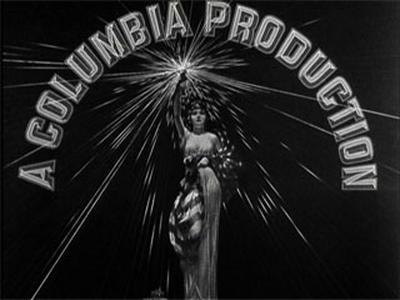


_(From_-_Lady_for_a_Day,_capped_from_the_Inception_Media_Group_blu-ray).png)


.png)


.png)
.png)
.jpg)


.jpg)


_(From_-_Super_8mm_colorized_print_of_the_Krazy_Kat_cartoon_The_Katnips_of_1940).png)
.png)
.png)

.jpg)
_(source_-_Gilda_(1946)).jpg)
.png)
_(From_-_the_end_of_The_Wild_One).png)


.png)


.png)


.png)


.png)


.png)
.png)
.png)

.png)


.PNG)
.png)
.png)


.png)
.png)
.png)
.png)
.png)


.png)


.png)
.png)
.jpg)
.jpg)