


Universal Pictures
From the Audiovisual Identity Database, the motion graphics museum
Descriptions by
Jason Jones, Jess Williams, Eric S., jupiterboy and Logophile
Captures by
Eric S., Bob Fish, Mr.Logo, codyfinke, Shadeed A. Kelly, Logozextreame102, Logophile, Muzzarino, V of Doom, TrickyMario7654 Donny Pearson, jupiterboy and StephenCezar15
Editions by
Eric S., Shadeed A. Kelly, V of Doom, Donny Pearson, Nathan B., Mr.Logo, shnick1985, AlekaJ1003,CD20Superness, jupiterboy, LMgamer36, Tjdrum2000, and others
Video captures courtesy of
Jordan Rios, LogicSmash, DaVinci030 2nd, Ken Horan, TR3X PR0DÚCTÍ0NS, Peakpasha, LogoLibraryinc, ThisIsLotso, BasicMasterReloaded, EnormousRat, Hb1290 Logos, ClosingLogosHD, lifequire, PFS 2021 After Sharks Gone (aka PFS 2021 Channel), Cassavetesforaday, VPJLogo, GrievousDude96, Universal Pictures and The Universal Rewind
Background
Universal Pictures is the oldest film studio in Hollywood, having originally been founded on April 30, 1912 as Universal Film Manufacturing Company by Carl Laemmle, a German-Jewish immigrant who settled in Oshkosh, Wisconsin. It was formed from a merger of several film companies: Independent Moving Pictures (IMP), Powers Motion Picture Company, Rex Motion Picture Manufacturing Company, Champion Film Company, Nestor Film Company, and the New York Motion Picture Company. In 1923, the studio was renamed Universal Pictures Corporation.
During the early 1920s, Irving Thalberg was entrusted with most of Universal's production policy decisions. Thalberg made distinct improvements of quality and prestige in Universal's output while dealing with director Erich von Stroheim's inability to control the expense and length of his films. Thalberg eventually fired Stroheim and replaced him with Rupert Julian. Louis B. Mayer lured Thalberg away from Universal in late 1922 to his own growing studio, Louis B. Mayer Productions, and Thalberg continued in the same position when that studio was merged into Metro-Goldwyn-Mayer in 1924. Without Thalberg's guidance, Universal became a second-tier studio for several decades.
In 1946, Universal Pictures merged with International Pictures, then headed by Leo Spitz and William Goetz. This team ran the newly-formed Universal-International Pictures, while Nate Blumberg and J. Cheever Cowdin remained at the helm of Universal Pictures, the parent company. Universal-International underwent significant expansion with Goetz at the helm. A major move was taking on the U.S. distribution of J. Arthur Rank's UK productions, including acclaimed films like David Lean's Great Expectations and Laurence Olivier's Hamlet. The studio also ventured into the non-theatrical market, acquiring home-movie dealer Castle Films and offering "highlights" reels from its film library for home-movie enthusiasts and collectors. In 1948, Universal-International ordered the destruction of all remaining silent film copies to collect the silver nitrate after World War II ended. Despite its expansion efforts, the production arm of the studio struggled to produce hits at the box office. By the late 1940s, Goetz was replaced and the studio returned to its roots of producing low-budget and series films. After Rank lost interest, his shares were sold to investor Milton Rackmil, whose company Decca Records took full control of Universal in 1952. The studio retained the Walter Lantz cartoon studio, which released its output alongside Universal-International's films.
In 1962, the Music Corporation of America (MCA), then the world's largest talent agency, purchased Decca Records, and consequently Universal-International, leaving Rackmil and Edward Muhl in charge as Dr. Jules Stein (Board Chairman) and Lew Wasserman (President) continued to guide MCA. After MCA divested itself of its talent agency business as a result of a consent decree with the Justice Department, Universal-International reverted back to the Universal Pictures name. In 1963, the motion picture and television operations of Universal Pictures and Revue Productions were merged by MCA into a new entity known as Universal City Studios, Inc.; both names would continue to exist as separate labels (however, Revue would be renamed Universal Television).
In 1990, MCA was acquired by Matsushita Electric, and was later sold to Seagram and Sons in 1995. In 1996, MCA was reincorporated and renamed Universal Studios, Inc., which retained ownership of the Universal Pictures film studio. In December 2000, French company Vivendi acquired Seagram's, renaming itself to Vivendi Universal; the deal was closed in January 2001. In 2004, Vivendi Universal sold 80% of its Vivendi Universal Entertainment division (which included Universal Pictures) to General Electric, then the owner of the NBC television network. GE then merged the operations of NBC and Vivendi Universal Entertainment into a new company known as NBCUniversal. Vivendi owned the remaining 20% of NBCUniversal until January 26, 2011, when it sold its stake back to GE. Two days later, cable provider Comcast acquired a 51% controlling interest in NBCUniversal, before buying it outright for $16.7 billion in March 2013.
Universal Film Manufacturing Company
1st Logo (September 12, 1913-1914)

.png)
Visuals: On a black background is a drawing of a ringed globe with the arched, stacked text "UNIVERSAL FILMS" over it. A plate with the text "NESTOR" or "SPECIAL" is seen with a trademark notice under the plate.
Variant: Sometimes, the text "NATIONAL BOARD OF CENSORS" is added under the globe.
Technique: This logo was a painting filmed by a cameraman.
Audio: The closing theme of the film.
Availability: Most of their silent films of this time were destroyed, while some went into the public domain and have recreated titles replacing the Universal references. This logo is known to appear on their early films including The Girl Ranchers and The Ohio Flood.
2nd Logo (July 22, 1914-1919)
-
 Standalone version
 -
 Almost a Scandal (1915)
 -
 A Great Love (1916)
 -
 The Sinking of Lusitania (1918)
.jpg)
_(From_-_Restored_Dutch_print_of_Almost_a_Scandal).png)
.png)
.png)
Visuals: On a black background is a circle with the text "UNIVERSAL" above it and "FILMS" below it; inside the circle is a trademark notice. A Saturn-like ring surrounds the circle, which reads "THE TRANS-ATLANTIC FILM CO. LTD." (Universal's British distributor at the time).
Variants:
- At the beginning of some films, the print logo appears at the top of the screen, which consists of the title of the film at the center.
- On The Sinking of the Lusitania, the print logo appears below the title card.
Technique: This logo was a printed illustration filmed by a cameraman.
Audio: The closing theme of the film. Otherwise, it uses a violin theme.
Availability: Like the last logo, this is hard to come across because most of their silent films of this time were destroyed, while some went into public domain and have recreated titles removing references to Universal.
- This is harder to find as there are more films destroyed with reissues plastering this logo; however, a select few films have turned up with their original credits and this logo intact.
- It last appeared on a silent film aired on TCM's Silent Sunday Nights.
- However, it can be found on the film By the Sun's Rays.
3rd Logo (August 16, 1914-December 22, 1918)
.png)
.png)
.png)

Visuals: On a space background, a sepia model globe is seen rotating, with the stacked, arched text "UNIVERSAL FILMS" over it and a symbol reading "MADE IN USA" (which resembles an Interstate Highway shield) in either bottom corner of the screen.
Variants:
- There are black and white and green versions which are known to exist.
- A variant exists in which the "UNIVERSAL FILMS" text actually wraps around the model globe instead of being superimposed over it; the "MADE IN USA" symbol is also omitted.
- On The Boy Mayor, the logo is bigger with stars all over it.
Technique: Live-action model work.
Audio: None.
Availability: This logo so far is known to appear on The Hedge Between, The Heart of Humanity and at the end of The Boy Mayor, all of which are in the public domain.
4th Logo (September 29, 1914-September 1, 1918)
-

-

-

-
 Idle Wives (1916)
 -
-

.webp)
.png)
.png)
_(From_-_Idle_Wives).png)
_(From_-_The_Purple_Mask).png)
.png)
Visuals: On a black background, a combination of a circle and a rounded rectangle surrounding the text "UNIVERSAL" inside it is shown. On the bottom left and right corners of the circle are the words "TRADE" and "MARK", respectively.
Variants:
- On title cards of various films, the print logo appears below, which contains the title of the film at the center with the byline or both the Rex Motion Picture Company and the Powers Picture Plays logos at the top of the screen. A copyright notice reading "Copyrighted [YEAR] by The Universal Film Manufacturing Company" appears at the bottom or on the lower-left corner of the screen, with the text "All rights reserved" on the lower-right. On some films, the words "Approved by the National Board of Review of Motion Pictures" are above "Copyrighted [YEAR] by The Universal Film Manufacturing Company". Sometimes, the words "Carl Laemmle, President" are seen on the lower-left screen.
- On The Boy Mayor, the logo appears at the bottom of the screen with "MOVING" above the word "UNIVERSAL" and "PICTURES" below.
- On 20,000 Leagues Under the Sea, the title card is in the different font.
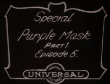
- The Purple Mask: Episode 5, Reel 1 uses a print logo below with the words "MOVING" above the word "UNIVERSAL" and "PICTURES" below.
Technique: This logo was a painting filmed by a cameraman.
Audio: None or the opening theme of the film.
Availability: Seen on Shack Next Door, The Boy Mayor, Scandal, Her Defiance, Where Are My Children?, Idle Wives, Eleanor's Catch, 20,000 Leagues Under the Sea, The Purple Mask, '49–'17, The Dream Lady, and Bread.
Final Note: Between 1920 and 1921, films from Universal would either have an in-credit notice, or none at all. It won't be until 1922 that Universal have an on-screen logo again.
Universal Pictures (1st era)
1st Logo (January 16, 1922-September 9, 1927)
.jpg)
.jpg)
_(Source_-_Soft_Shoes).png)
Visuals: Against some dark clouds, a biplane flies around a rotating globe, leaving a trail of smoke that forms the words "UNIVERSAL PICTURES".
Trivia: Given the fact that the first picture of the Earth from space was not taken until 1967, the globe in the logo is inaccurate. Madagascar is three times larger than in real life, and Japan and the Philippines are missing. Also, the globe spins to the left instead of to the right.
Variants:
- A sepia variant exists.
- Soft Shoes (1925) uses a blue-toned version of the logo.
Technique: Live-action model work combined with wiping effects.
Audio: The opening theme of the film.
Availability:
- This logo can currently be seen on some 1920s Universal films on TCM's Silent Sunday Nights.
- It was also seen on Soft Shoes and The Cat and The Canary.
2nd Logo (January 18, 1925-December 25, 1928)
.jpg)
.png)
.png)
.png)
Visuals:
- Smouldering Fires (1925): On a dark cloudy background, a globe slowly rotates. After a few seconds, a shot of Carl Laemmle smiling in the middle forms over the globe. After a few seconds, the words
fade in below the globe. "Carl Laemmle" is in a script font and "P R E S E N T S" is below it.
- Head Winds (1925): On a black background, the globe from the above variant is shown in the top left corner and rotates at a normal pace. On the bottom right-hand corner is the text "Carl Laemmle" in a script font like the normal logo, with "Presents" below it.
Variants:
- Another variant has the rotating globe but with the "CARL LAEMMLE" text in a capitalized font.
- At the end of Smouldering Fires, the text "It's a Universal Picture" is shown on a black background.
Technique: Live-action model work and compositing.
Audio: An organ theme for the normal logo, while the variant has a descending orchestral theme which could be an opening theme to the film. On both prints of the film, it would be normally silent like the original film.
Availability: Seen on Smouldering Fires, Head Winds, The Goose Woman, and The Last Warning.
3rd Logo (September 9, 1927-1936)
-
-
 Colorized version
 -

.jpg)
.jpg)
.png)
-
-
-

-

-

-

-

-
 Spanish Version
.jpg)
.jpg)
.png)
.png)
.png)
.jpg)
.png)
.png)
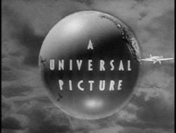
Visuals: On a cloudy background, a globe rotates as a biplane flies around it. The text "A UNIVERSAL PICTURE" wipes in diagonally as the biplane passes the globe.
Trivia: The biplane is a Lockheed 8C Sirius.
Variants:
- The position of the globe varies depending on the film.
- The logo was cropped to 1.85 for Universal's 75th Anniversary logo in 1990. However, full-screen prints of films using said logo retain the full aspect ratio of this logo.
- A colored variant exists where the entire logo is light blue except for the continents, which are green.
Closing Variants:
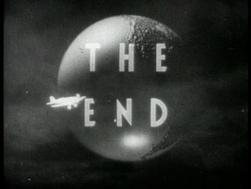
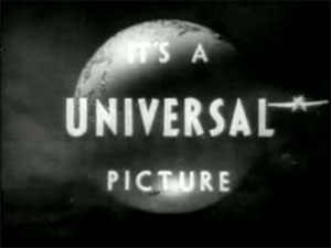
- The words "THE END" are seen superimposed over the globe, and the sky is darker. Seconds later, the text "IT'S A UNIVERSAL PICTURE" fades in.
- On Hell's Heroes, the words "The End" are shown in a script font inside the oval with a rainbow-like shape with "UNIVERSAL PICTURES" arched over the rotating globe. On the left side of the ribbon is the text "COPYRIGHT [YEAR] BY UNIVERSAL PICTURES CORP." and on the right side are the words "CARL LAEMMLE" with "PRESIDENT" below it.
- Another closing variant exists where the globe rotates in the bottom right corner of the screen. On the top, it says "The End" in a cursive font. "It's a Universal Picture" (also in cursive) is superimposed over the globe. A ray of light also shines down on the globe. On some films, the text is on the bottom left corner. Starting around 1933, the text is in a Broadway font.
- On short films, instead of the text saying "It's a Universal Picture", the text is replaced with "It's a Universal Short".
- On cartoons, it says "IT'S A UNIVERSAL CARTOON" in a sans-serif font.
Technique: Live-action model work.
Audio: The sound of the biplane's engine.
Availability:
- This logo can sometimes be seen after the current Universal logos on certain movies.
- The earlier DVD releases of Frankenstein and Dracula have plastered this with the B&W variation of the 1997 logo, while the later VHS releases of the films plaster it with the B&W variation of the 1963 logo.
- Early Betamax and VHS releases of said films do not use a logo at all; however, this logo can still be seen on the alternate opening for the former on its 2005 Special Edition DVD release thereof, as well as on the 2012 DVD and Blu-ray releases of both films.
- This logo is also seen on Bride of Frankenstein, including its 1984 MCA Home Video VHS release.
- It is also seen on TCM's print and the Criterion and Universal DVD releases of My Man Godfrey, although the 6th Criterion logo plasters it on its respective print, and several public domain prints of the film have the logo removed entirely.
- This logo is also restored for the Criterion Blu-ray and DVD release of the 1936 version of Show Boat.
- It is also seen on a cable print of The Texan, a 1930 Paramount film.
Legacy: This is considered an impressive logo for its era.
4th Logo (April 18, 1937-December 15, 1947)
-
-

-
 Brown Toned
 -
 Gold Letters
 -
 Blue Version
 -
 Spanish Version
 -
 Off-center variant
.jpg)
.png)
.jpg)
.png)
.png)
.jpeg)
.png)
Visuals: On a black background with spinning stars, a stylized glass globe is shown rotating, tilted at an angle. The words "A UNIVERSAL PICTURE", in a stylized Art Deco font, slowly orbit around the globe.
Trivia: This is one of only two Universal logos (the other being the 1914 logo) not to make use of the Earth as a globe.
Variants:
- On some color releases, like color Woody Woodpecker cartoons at the time, the logo is tinted blue.
- On the colorized versions of the Universal Sherlock Holmes movies, the letters are gold colored.
- Like the previous logo, this logo was also cropped to 1.85 for Universal's 75th anniversary logo in 1990. The full screen version retains the full aspect ratio.
- A Spanish-language version exists, with the text now reading "PELICULA UNIVERSAL". This may have been seen on some Spanish-dubbed Woody Woodpecker shorts.
- An off-center variant exists.
Closing Variant: Superimposed on a special background or in the last seconds of a movie is the words "The End" with lettering that varies on the movie, along with the text "A Universal Picture" or "A Universal Release".
Technique: Live-action model work. This logo was created by set designer Alexander Golitzen and photographed by special effects artist John Fulton.
Audio: A proud, bombastic orchestral fanfare, composed by Jimmy McHugh.
Audio Variant: From about 1945 onwards, the opening theme of the movie is used.
Availability:
- Can be seen on Universal releases of the era, beginning with Top of the Town.
- This logo does not appear often on TV, since the movies it appears on do not appear as often as newer ones; however, broadcasts of some of those films on the MeTV program Svengoolie happen to be one of the best sources of this logo (as well as older logos from other studios).
- It also often shows up on Johnny Mack Brown films from the time period on Starz Encore Westerns.
- The last regular appearance of this logo was on the Woody Woodpecker cartoon "Woody the Giant Killer".
- It also showed up on a Screenpix Westerns airing of Destry Rides Again on August 27, 2021.
- It is unknown if this logo is preserved on any prints of the 1943 version of The Phantom of the Opera.
Universal-International Pictures
Logo (August 28, 1946-April 19, 1964)
-

-

-

-

-

-
 35mm print
 -
-
-
-
-
-

-

-

-

-
 Rare German Version
 -

.jpg)
.png)
.jpg)
.png)
.png)
.webp)
.jpg)
.jpg)
.jpg)
.jpg)
.jpg)
.jpg)

.jpg)
_-_Closing_Variant.png)
Visuals: A model globe rotates on a space background, with the text "Universal International" (in white for B&W films or yellow for color films) in an italic Roman font (with the letters "U" and "I" bigger than the rest of the letters), superimposed over it.
Variants:
- A widescreen version of this logo was used for films shot in 2.35:1 aspect ratio.
- CinemaScope films have the starfield looking more different, and the company name is larger and more stretched.
- In Germany, the chyroned extra text "IM UNIVERSAL FILMVERLEIH INC" appears in white circles around the globe. This exists in both B&W and color.
- On It Came From Outer Space, the logo has a 3D effect and the stars "shine".
Byline: Later on, the credit "EDWARD MUHL, IN CHARGE OF PRODUCTION" would appear in the lower-left corner.
Closing Variant: Same as above, but the text reads "A Universal-International Picture".
Technique: Live-action model work.
Audio: None or the opening theme of the movie.
Audio Variant: On some films such as The Egg and I and The Naked City, the bell theme from the International Pictures logo is used.
Availability:
- Again, seen on Universal International releases of the period.
- Sometimes, the 11th logo would precede it on later releases of movies from the period (like the DVD release of To Kill a Mockingbird).
- It is also preserved on the Magnetic Video release of Blood of the Vampire.
- It was also seen on the original prints of Horror of Dracula (released as simply Dracula in the UK), although video releases either remove it or plaster it with the 1984 Warner Bros. Pictures logo.
- However, the 2018 Warner Archive Blu-ray release restores this.
- It can also be seen on all releases of Mystery Science Theater 3000: The Movie at the beginning of This Island Earth as Mike, Tom Servo and Crow enter the theater.
- It is also seen on Amazon Women on the Moon at the beginning of the titular film-within-a-film.
- The CinemaScope variant, aside from films shot in CinemaScope, can be also seen on U.S. prints of King Kong vs. Godzilla.
Universal Pictures (2nd era)
1st Logo (December 5, 1963-May 18, 1990)
.jpg)
.png)
.png)
.png)
.png)
.png)
.png)
.jpeg)
_(%22Presents%22_variant,_1963-1972_version)_(Taken_from_Monster_of_Ceremonies).png)
.png)
.png)
.png)
.png)
.png)
.png)
Visuals: The camera zooms through space, and a pair of Van Allen radiation belts start to form. A rotating globe appears in the distance, and as the camera gets closer to it, the gold word "UNIVERSAL" (in Futura Bold) fades in and zooms out to a comfortable distance as the camera stops in front of the globe and the aforementioned Van Allen belts surround the globe.
Variants: Several different versions of this logo exist. This is going to get complicated, so let's explain this simply:
- 1963-1973: "A UNIVERSAL PICTURE/RELEASE", with the "UNIVERSAL" text sandwiched between "A" and "PICTURE"/"RELEASE". This can also be seen on certain movies that use this logo for a retro effect.
- "PRESENTS" is underneath the "UNIVERSAL" text. Sometimes, "UNIVERSAL PRESENTS" starts blurred, but becomes clearer as the globe zooms in fast. This variant is seen on movies like Secret Ceremony, The Killers (1964), Two-Lane Blacktop and Anne of the Thousand Days and this variant appearance in Walter Lantz Cartoons as like Woody Woodpecker cartoon since "Saddle-Sore Woody" (1964) until "Bye, Bye, Blackboard" (1972).
- 1971-1990: The orange byline "AN MCA COMPANY" (in Eurostile Bold) fades in below the "UNIVERSAL" text. The Scope variant has it in a different font.
- "Scope": Shown in a wide ratio of 2.20:1 or 2.35:1 widescreen, the globe appears to zoom in rather slowly, and the "UNIVERSAL" text is blurred when it fades in, becoming clearer as it zooms out. The logo is much wider than usual, to accommodate the extra space. This is seen on films shot in this format such as High Plains Drifter, The Sugarland Express, Jaws, The Car, Halloween II and III, John Carpenter's The Thing, Scarface (1983), Firestarter (1984), The Dark Crystal, The Last Starfighter, Dune (1984), Legend, Prince of Darkness, They Live and Born on the Fourth of July. It also had a bylineless variant of its own, which can be found on Tell Them Willie Boy Is Here and The Day of the Jackal. A sepia-tone variant can be found on The Deer Hunter.
- "Flat": Presented in 1.14:1 open matte for 35mm uncropped film scan prints, 1.37:1 academy or 1.85:1 "matted" widescreen, the logo appears to move somewhat faster than the widescreen version. The "UNIVERSAL" text is not blurred and simply fades in. Seen on films such as Coogan's Bluff, Duel, Charley Varrick, The Sentinel, National Lampoon's Animal House, The Jerk, Little Miss Marker (1980), Coal Miner's Daughter, Somewhere in Time, An American Werewolf in London, E.T. The Extra-Terrestrial, Fast Times at Ridgemont High, Cat People (1982), Videodrome, Monty Python's The Meaning of Life, Sixteen Candles, The Breakfast Club, Back to the Future I and II, Weird Science, Brazil, Out of Africa, An American Tail and The Land Before Time. In an earlier variant, used in tandem with the normal version, "A UNIVERSAL PICTURE" starts blurred, but becomes clearer, along with the Edward Muhl byline. The globe zooms in faster in this variant, used on movies like Shenandoah, Send Me No Flowers, Charade and Father Goose. A B&W version of this variant can also be seen on Kitten with a Whip, which was featured on an episode of Mystery Science Theater 3000 (with the logo intact). It was also the default pan-and-scan version of the logo and plastered the above variant on older VHS copies of most if not all, Universal films shot in scope (a notable exception being the original VHS of The Dark Crystal, which was released by Thorn EMI Video).
- Off-center: Only known to exist on old video prints of Charade, the logo is slightly off-center, due to a sloppy job reformatting the aspect ratio of 1.85:1 into 4:3. Another off-center version can be found on the MCA Discovision, MCA Videocassette Inc. and MCA Home Video releases of Jaws.
- In the early years of the "Flat" version of the logo, Universal had a small registered trademark symbol (®) below the "L" in "UNIVERSAL," which faded in alongside the zooming text. By 1975, Universal added a larger ® in the same position, but it fades in after the text zooms out. However, the smaller ® behind the bigger ® can still be seen.
- Like the last logo, a credit for then-Universal head Edward Muhl can be seen on the lower-left of the first movies to feature this logo.
- The 1971 version is bylineless on some films.
- The 1971 version, but with "PRESENTS" underneath the byline in a smaller font. This was seen on American Graffiti.
- The widescreen version of Jaws 3-D has the MCA byline in a more extended font.
- There is a variation that contains the word "RELEASE" below the MCA byline. This was used to plaster the Paramount logo at the end of 1980s reissue prints of Alfred Hitchcock films owned by Hitchcock himself (including Rear Window and 1956's The Man Who Knew Too Much (including an August 11, 2001 UK airing of the latter on BBC Two)), and also appeared on U.S. theatrical prints of The Slipper and the Rose: The Story of Cinderella.
- A black-and-white version was seen at the beginning of the 1980 MCA Videocassette, Inc. VHS release of Scarface (1932) (Also on the 1984 MCA Home Video reprint), the 1980 VHS release of Psycho, and the 1965 unsold TV pilot Dark Intruder (which received a theatrical release).
- There is another scope variant where the 1.85 version is cropped to 2.35. This can be found on Coupe De Ville, Bird on a Wire, and Jaws: The Revenge. However, the GoodTimes DVD of the latter uses the regular scope variant.
- On most movies from 1989 and 1990, the MCA byline has more of a red-orange color, and the Van Allen belts are more purple. This can be found on Parenthood, Uncle Buck, Field of Dreams, the VHS release of Born on the Fourth of July, Opportunity Knocks, Coupe De Ville, Bird on a Wire, and the theatrical trailers for Back to the Future Part III and Problem Child (both of which ultimately used the 75th Anniversary variant of the 9th logo). However, some movies from 1989, such as Back to the Future Part II, The Dream Team and K-9, would still use the original variant of the MCA byline. A clip of this variant was used for the Universal 75th Anniversary logo, which also uses clips from the 5th and 6th logos.
- On the end of Discovery Channel Southeast Asian prints of Jaws and Jaws 2, the logo is faster and the credits music also plays over the logo.
- While a dedicated 3D variant exists (having been created for Jaws 3D and Metalstorm: The Destruction of Jared-Syn), the Scope version of the standard logo was converted to 3D for the stereoscopic reissue of Jaws in 2022.
Technique: Live-action model work for the globe, combined with cel animation for the Van Allen belts. This logo was animated and designed by Universal Title and Optical (commonly known as "Universal Title"), who was also responsible for the animation for the Universal Television logos and handled the titles and optical effects for most Universal films and television series until 1990. The globe was hand-painted on a rubber ball by Eyvind Earle, who did the space background and the Van Allen belts as well.
Audio: None or occasionally the opening theme of the movie. Such memorable instances include Father Goose (composed by Nelson Riddle), The Ghost and Mr. Chicken, Scarface (1983), The Dark Crystal, and The Night Walker (both composed by Vic Mizzy). The opening tag from the latter film was also heard in abridged form on The World of Abbott and Costello. The 1972 feature-length pilot of the TV series Emergency! used a dramatic, drum-driven fanfare based on the series' theme.
Audio Variants:
- On the U.S. DVD release of the Battlestar Galactica movie (which is really the pilot episode "Saga of a Star World" released as a theatrical film in Europe), the 1963 logo is heard with the CIC fanfare.
- On the 1984 MCA Home Video VHS release of The Man Who Knew Too Much and a 1984 German ARD airing of The Trouble with Harry, this logo has the Paramount/VistaVision music.
- Sometimes, it used an updated version of the 1936-1947 fanfare (composed by Miklos Rosza for the 1982 film Dead Men Don't Wear Plaid); this tune was mostly heard over the logo of Universal Pay Television.
- On a print of The Projected Man featured on Mystery Science Theater 3000, the logo curiously uses the Les Baxter-composed fanfare from the 1960-1963 American International Pictures logo (which was actually used for the logo of a British company called Compton Films, also the UK distributor). However, the Shout! Factory Blu-ray release just uses the opening theme.
- Monty Python's The Meaning Of Life has its own unique fanfare (only on the main feature, not the preceding short feature The Crimson Permanent Assurance), which was reused on the second disc of the 2003 special edition DVD releases.
Availability: Used for 27 years and was never plastered over (the 20th Anniversary version of E.T. the Extra-Terrestrial does plaster this with a special variant of the 1997 Universal logo; however, the 1982 variation is still seen on the 1988 and 1996 VHS releases, the theatrical DVD and Blu-ray release, and airings on HBO and Cinemax, as well as the 2015 Nickelodeon airing).
- This logo made its theatrical debut on Charade, released on December 5, 1963, and made its last regular appearance on Bird on a Wire, released on May 18, 1990.
- The "PRESENTS" variation of the logo is seen on Silent Running and Journey to the Far Side of the Sun, followed by the "a GERRY ANDERSON CENTURY 21 CINEMA PRODUCTION" logo.
- On Airport, this logo is seen after the end credits with the opening P.A. track for the film playing over it (pan-and-scan releases apparently had the logo and track at the start of the film, if the 1981 MCA Videocassette, Inc. release is anything to go by).
- A similar occurrence also occurs on John Carpenter's The Thing (without any audio; this time around, the Universal logo remains at the end, even on pan-and-scan prints).
- This logo was originally not seen on the following films (although recent releases of some of these films have this logo added on at the start, however): The Electric Horseman, 1941, The Blues Brothers, Torn Curtain, Family Plot, and Frenzy. The Emergency! version can be found only on the pilot episode, available as part of the season 1 DVD set. (The episode is not rerun as part of the series' syndication package.)
- It is unknown if this logo is seen on any prints of Watchers.
- It is also unknown if this logo is seen on any Italian prints of films issued by Walt Disney Productions between 1969 and 1970, among which was The Love Bug.
- This logo was also seen on theatrical prints of Associated Film Distribution titles they purchased the rights to; however, most home video, TV, and/or streaming prints edit the logo out (since Universal only had theatrical rights; ITC Entertainment or other successor companies retained all other rights).
- On Golden Pond, for instance, had this logo on theatrical prints, but most video prints have this logo omitted (it is still preserved intact on the 1987 Mexican VideoVisa VHS release, however).
- Similarly, it was also seen on the theatrical release and an HBO airing of The Great Muppet Caper, but all home video releases of the film delete the logo.
- Conversely, the scope variant was deleted from Jim Henson Video's VHS release of The Dark Crystal, but is still intact on Sony Pictures Home Entertainment's VHS and DVD releases of the film; the original Thorn EMI Video also retains it.
- This logo can also be found on domestic prints of Carolco Pictures' Wes Craven's Shocker, Field of Dreams and The Wizard.
- However, on international TV airings of The Wizard, the Universal logo is blacked out, with the music still playing.
- It was also seen on some trailers for Back to the Future: Part III, Ghost Dad, Jetsons: The Movie, Problem Child, and Darkman, respectively, all of which ultimately used the next logo.
- This logo is also seen at the beginning of the 1989 TV film Nightlife, despite being an MTE production.
Legacy: One of the most well-known logos in film due to its 27-year lifespan and use in many popular films.
2nd Logo (May 25, 1990-July 16, 1997)
-
 75th anniversary variant (Scope)
 -
 75th anniversary variant (16:9)
 -
 Spanish 75th anniversary variant
 -
 16:9
16:9 -
 Scope
Scope -
 4:3
4:3 -
 Bylineless
 -
 Textless
.jpg)
.png)
.png)
.png)
.png)
.png)

.png)
Visuals: A large flash appears from the far right side of the Universal globe, which is on a new, detailed starfield background. The camera moves around the globe as the flash dims away and see the shiny golden word "UNIVERSAL", in a brand new font (in Copperplate Gothic Bold), appears from behind the globe and circling it. The screen zooms out and the globe moves to the center, as the word "UNIVERSAL" straightens itself out and takes its place across the globe. The byline "AN MCA COMPANY", in gold and in spaced-out letters to fit the width of "UNIVERSAL", appears below the logo.
Trivia: The 75th anniversary may refer to the anniversary of Universal City Studios' opening in 1915, rather than Universal Pictures itself.
Variants:
- For the logo's debut and its first official year (1990), the initial version of this logo is different from the one used afterward. It begins with clips of the 1927 and the 1936 Universal Pictures logos, ending with the previous logo as if it were a grand unveiling or passing of the torch. This is followed by the new logo animation, which, in the end, has the words "75th ANNIVERSARY" on top of it, with "75" in the middle of "ANNIVERSARY", which is in spaced-out letters like the MCA byline, and written out in script with "th" flashing in next to "75".
- A rare Spanish version exists, which was used on a promotion for the company's film package in Spain.
- On some widescreen films such as Far and Away, the logo is zoomed out further than normal.
- On some widescreen films, such as Career Opportunities and The Hard Way, the 75th-anniversary logo has the widescreen in its original aspect ratio of 2.35:1.
- A variant without any text besides the Universal lettering exists.
Technique: Contrary to popular belief, this logo was not done in CGI, but was produced using models filmed with motion control. The globe and letters were shot at the Chandler Group, and the background was originally a painting by Eric Von Schmidt. The compositing and byline were done by Studio Productions (now Flip Your Lid Animation), who also created the logos for Paramount Pictures and 20th Century Fox in 1986 and 1994, respectively. The logo was filmed in 70mm and is the first regular logo of any major studio created specifically for large format.
Audio: A majestic orchestral fanfare composed and conducted by James Horner.
Audio Variants:
- A French horn fanfare is heard during the first half of the 75th Anniversary logo before segueing into the normal theme (albeit with some differences from the 1991 version, such as the music not "ending" at the fade-out). A faster version of this interlude was later used as the 1991 Universal Television theme.
- The 75th Anniversary logo is silent on the 1991 Media Home Entertainment/Fox Video VHS release of Closet Land.
- On Reach the Rock, the Spanish audio track on the Universal Blu-ray release of Dazed and Confused, and a TCM France airing of Casino, the 1997 fanfare from the next logo is heard, most likely due to a reverse plaster error for the two latter cases.
- On AMC prints of The People Under the Stairs, the 2012 fanfare is heard, once again due to a reverse plastering error.
- On the Russian dub of Happy Gilmore, older HBO airings of Jungle Fever, AMC's print of Tales from the Crypt Presents: Bordello of Blood, and the Blu-ray release of Backdraft (the latter when the Turkish audio track is selected), the 1990 fanfare is in a lower pitch.
- Sometimes, the logo is silent.
Availability: Seen on all Universal releases of the era.
- This logo made its theatrical debut on Back to the Future Part III, released on May 25, 1990, and made its final appearance on McHale's Navy, released on April 18, 1997.
- The final film to use the 75th Anniversary version was A Kiss Before Dying, released on April 26, 1991.
- Recently, this logo can also be found on Commandments (released by Gramercy Pictures), and the 1997 telefilms such as Any Place but Home, Buried Alive II (however, the PAL DVD release has the next logo instead), Divided by Hate and Our Mother's Murder (aka Daughters).
- The version without the "75th Anniversary" wording debuted on Backdraft (although trailers for it still have the 75th Anniversary logo).
- Most prints of Mallrats (including premium network broadcasts and video releases) have this logo preceding the Gramercy Pictures logo.
- However, most recent prints such as the Blu-ray release have this replaced with the 2002 Focus Features logo.
- This logo precedes the 1987 New Line Cinema logo on current prints of Drop Dead Fred (a 1991 PolyGram/Working Title production which New Line distributed for the U.S.; however, Universal holds international rights due to them controlling some of the pre-1996 PolyGram library).
- The UK 25th Anniversary Blu-ray release from Final Cut Entertainment also retains this combo, as well as the Vinegar Syndrome U.S. Blu-ray release thereof.
- Although MCA was renamed Universal Studios, Inc. on December 9, 1996, the MCA byline continued to appear on films released until early to mid-1997, except for The Lost World: Jurassic Park (used in the trailers and TV spots instead, including the print logo at the end).
- It was also seen on some trailers for The Lost World: Jurassic Park (notably the teaser trailer), Leave It to Beaver, A Simple Wish, and The Jackal, all of which ended up using the next logo.
- On the international release of Street Fighter, this logo is plastered by the Columbia TriStar Film Distributors International logo and the opening credits are edited to credit Columbia Pictures instead; however, the globe and sky still remain.
- A portion of this logo is also seen about halfway through The King.
- This logo was also seen on Comet's airing of the season 1 opening of Sliders.
- This logo is seen on the international teaser trailer of Twister, which can be found on the Brazilian VHS release of Diabolique and the Japanese Laserdisc release of self-titled, but it may have possibly been seen on the 35mm prints of the same trailer for the film.
- It is also seen on international prints of The American President, True Lies and Strange Days, among others. Universal had international rights to those respective films.
- It is also preserved on the U.S. VHS releases of Mystery Science Theater 3000: The Movie (with the Gramercy logo appearing after it) and the telefilm The Companion.
- It was also originally seen on some direct-to-video and further television film releases; however, the next logo plasters it on streaming platforms.
- The bylineless logo was seen on the original airings of television films, and is also seen on the Me-TV Toons' airings of the animated series The Adventures of Rocky and Bullwinkle and Friends, even though the distribution rights of the latter moved to WildBrain in 2022.
- This logo can also be found on the 1997 U.S. VHS release of Vertigo, in addition to the 1998 DVD release.
Legacy: This is yet another popular logo from the company. Elements from this logo would serve as basis for the next two logos.
3rd Logo (May 19, 1997-February 16, 2012)
.png)
_A.png)
_(From_-_older_prints_of_Babe_Pig_in_the_City).png)
.png)
.png)
.png)
-

-

-
 E.T. The 20th Anniversary variant
 -
 E.T. The 20th Anniversary variant (alternate)
 -


-

-

-

-
 German version
 -
 2008 version


.png)
.png)


.png)
-
 Corporate version
 -
 Corporate version #2
 -
 Corporate version #3
 -
 Full corporate version
 -
 Concept drawings, seen on Identica Partnership's website

.jpg)
.jpg)

.jpg)
Visuals: On a black background, an arc slowly appears and brightens. A series of lights begin appearing below the arc, revealing that this is another globe, looking over Europe. The camera moves down as the lights appear all over Europe, and then Africa (the Earth's continents now have a green, yellow, and red color scheme). As the camera begins to zoom out, the word "UNIVERSAL", in a modified version of the font from the previous logo named Universal Serif (this time the text is still gold, but has the inner white part of the text rising out of a gold outline), rotates to the front of the globe as the lights emanating from the continents dim out. By this time, the globe is shining from the back. Unlike the previous 2 logos, no corporate byline is present as MCA was renamed to Universal Studios around the time this logo was introduced.
Trivia: The logo, designed by Identica Partnership; was introduced to coincide with the rebranding of MCA, Inc. as Universal Studios, Inc. on December 9, 1996, and in fact, the logo technically debuted in print form on the same day.
Alternate Descriptive Video Descriptions:
- Now in a black sky a sliver of sunlight crests the Earth. Rays of light shoot off the continents and a three-dimensional word orbits the planet. Universal.
- Now in a black sky a sliver of sunlight crests the Earth. Rays of light shoot off the continents and a three-dimensional word orbits the planet. Universal. A web address appears. www.universalstudios.com.
- Now in a black sky a sliver of sunlight crests the Earth. Rays of light shoot off the continents and a three-dimensional word orbits the planet. Universal. A Division of NBC Universal.
Variants:
- On home video releases and TV movies, the logo appears videotaped.
- A shorter version of this logo exists, beginning as the "UNIVERSAL" text slides in over the globe, with a shortened version of the fanfare. This is usually seen at the end of documentaries produced for DVD by Universal Studios Home Entertainment, with a URL for Universal's website.
- The very first versions of the logo contained a small copyright notice in the bottom-right corner set in Gill Sans, which reads "©1997 Universal City Studios, Inc.".
- From November 13, 1998 to March 19, 2010 (with some exceptions), the URL "www.universalstudios.com", in an orangish color and set in the Charcoal typeface (a Macintosh font), fades in at the end. In the 1998-1999 URL variant, the copyright information fades in with the URL; however, the copyright was removed by 1999.
- Sometimes, on scope films, either the URL or the NBC Universal byline is pushed up to the light on the globe.
- An early version of the 1998 URL variant exists, which has the URL and copyright stamp in the Univers typeface.
- Sometimes, the logo appears closer at first, but then as the animation progresses, it zooms back.
- The biggest variation came on November 21, 2001, when the studio celebrated the 20th anniversary of E.T. the Extra-Terrestrial. The logo animates as normal until the very end, when the "UNIVERSAL" text fades out and the silhouette of E.T. and Elliott, on their bike, fly across the shining globe. Text appears on the bottom, "UNIVERSAL STUDIOS CELEBRATES E.T. THE 20TH ANNIVERSARY" with "E.T." in its original logo font. This was used in November 21, 2001 on Spy Game, February 19, 2002 on the VHS release of Balto II: Wolf Quest, February 22, 2002 on Dragonfly, and March 22, 2002 on the 20th Anniversary edition of E.T. The Singaporean HVN VCD releases of The Bourne Identity, D-Tox, About a Boy, and The Scorpion King also have this variant of the logo (in the case of the first title, it plasters the normal logo and its opening audio to the movie).
- A different version where it just says "E.T. THE 20TH ANNIVERSARY" also exists. In this version, "THE 20TH ANNIVERSARY" is in a different font and a small copyright notice appears at the bottom-right, which reads "©2001 UNIVERSAL STUDIOS". This version was seen on 40 Days and 40 Nights and on the premiere of the 20th anniversary E.T. re-release at the Shrine Auditorium on March 16, 2002. It is also seen on the VHS release of K-PAX, as well as the Canadian VHS releases of A Beautiful Mind and Big Fat Liar. Shortly afterward, beginning with The Scorpion King, the normal logo was reinstated.
- In 2002, the globe was graphically enhanced with a darker color, and in 2005, it would appear rotating below the arc at the beginning of the logo. Also, the light rays are darker and the shadow appears at the same time as the website URL, which is now set in the Geneva typeface, and fades in differently. Universal would also use this as the main variant starting with The Wedding Date in 2005.
- Another variant which has a darker mood exists. The presentation is the same as usual, except the initial darkness of the globe is darker than usual (pay close attention to that). Then, after the word "UNIVERSAL" is rotated from behind, either a darker, thicker shadow suddenly pops out, then gets brighter than normal towards the end after it locks in position. The entire globe zooms out farther than its intended mark, and instead of slowing to a stop, it stops hard in its far-back position. The globe appears much further back in letterbox format. This variant can be found on 8 Mile, American Wedding, Seabiscuit, Master and Commander: The Far Side of the World, The Bourne Supremacy, and White Noise. The variant with the NBC Universal byline (and no shadow) can be seen on stereoscopic 3D prints of Despicable Me (the 2D prints use the normal variant with the NBC Universal byline).
- On 4:3 prints of films from 2003 until 2012, starting with Peter Pan and ending with Wanderlust, the logo zooms out to a much farther distance than usual. This is because the films are shot in a 1.66:1 ratio, and framed for 2.39:1 scope.
- In 2008, the original 1997 version of this logo was remastered for digital releases and TV airings.
- Starting with Cirque du Freak: The Vampire's Assistant on October 23, 2009, the URL was removed in favor of the byline "A DIVISION OF NBC UNIVERSAL", also in an orangish color and in the Copperplate Gothic typeface, which fades in toward the end. The byline was also added to the logo of NBCUniversal's television division at the time, Universal Media Studios.
- On some films, such as Munich, Coraline and Nanny McPhee Returns, the logo is bylineless.
- On German movies such as One Way (2006) and The Coming Days (2010), the 1999 variant is used, but "UNIVERSAL PICTURES" in an orangish color and the Univers typeface fades in.
- Since 2004, this logo was used on licensed games (due to the closure of Universal Interactive). It's either the still print logo on a black or white background (mainly for GBA, NDS, and mobile games), or just the last part with the shining (with or without the copyright stamp); however, a very few amount of titles like Despicable Me: The Game use the entire animation. Sometimes, it replaced the Universal Interactive logo on earlier games like The Grinch.
- On Curious George and The Pirates Who Don't Do Anything: A VeggieTales Movie, the logo is brighter.
- On the promo of Universal Orlando Resort, the URL "www.universalstudios.com" is replaced with "www.universalorlando.com".
Closing Variant: On the pre-2006 international home entertainment prints of Barbie in the Nutcracker and Barbie as Rapunzel, the first version of the logo appears in the last few seconds.
Technique: CGI by Picturemill, who also did the 2008-09 Nickelodeon Movies logo and the current 20th Century Studios logo. They would also return for the 2002 and 2005 enhanced variants as well.
Audio: It starts with a powerful, majestic French horn fanfare, followed by two percussion hits. Then, the same French horn fanfare, followed by two more hits. Then, a very majestic orchestral fanfare (which adds in more brass instruments, strings, xylophones, and drums) as the logo is completed, with the French horn theme coming back near the end. This was composed by Jerry Goldsmith.
Audio Trivia:
- The piano rendition of the fanfare's final fifteen notes with strings (in a style of Windows XP's startup sound) can be heard on the home page of Universal Pictures from 2004-2010.
- Furthermore, during certain grand opening events at Universal theme parks, the full version (in either NTSC or PAL pitch) of the fanfare can be heard when a key member of any of the Universal Studios theme parks or Universal Destinations & Experiences arrive to the stage.
Audio Variants:
- For the E.T. variant, the music is changed in an arrangement by John Williams and Elias Associates to go with the customized E.T. logo; there is only one horn fanfare/hits sequence, followed by the end fanfare. This then segues into the theme from E.T. as he and Elliott fly across the globe. Most of the other films with this variant use the opening theme of the film instead.
- On April 19, 2002, there was a re-orchestration of the 1997 fanfare, again in an arrangement by John Williams. It has the same melody, but like the E.T. logo, it is in a different key and sounds more "powerful" with added drums; this version made its only appearance on The Scorpion King (the first film released after the E.T. variant ceased usage).
- A live version of that fanfare also exists, which can be heard at the premiere of the 20th anniversary E.T. re-release, to which it would also be a bonus audio option on its DVD release. Also, if one listens closely, an applause from the audience watching the premiere when the bike shows up can be heard.
- On some prints of Tremors II and international Blu-ray releases of The American President and Strange Days, the 1990 fanfare from the previous logo is heard due to a plastering error (however, Syfy prints have the correct 1997 fanfare). This error is also present on a Polish broadcast of We're Back! A Dinosaur's Story.
- On a Foxtel Movies print of The Hurricane, the second horn theme (which normally comes out of the right channel) is omitted, likely due to a mastering mistake.
- On The Lost World: Jurassic Park (the logo's debut film) and some prints of How the Grinch Stole Christmas, the fanfare is slightly re-orchestrated.
- On Phil's Dance Party (albeit as a variant) and Freeform prints of Nutty Professor II: The Klumps, the music from the next logo is heard, appearing on the latter due to bad plastering.
- On Vudu prints of Barbie and the Magic of Pegasus, streaming prints of pre-2006 Barbie DTV movies, a French television airing of The Green Mile, and AMC prints of The Lost World: Jurassic Park, Life (1999), Love Actually, and The Fast and the Furious: Tokyo Drift; the logo's music is in a lower pitch.
- An extended and re-orchestrated version of the fanfare exists which was created for Universal Studios Hollywood, which can be heard here. The later version uses the regular fanfare with the orchestral build-up intact which can also be heard here.
- At the beginning of Universal 360: A Cinesphere Spectacular at Universal Studios Florida, the fanfare is re-orchestrated by Brad Kelley, which can be viewed here.
- On Scott Pilgrim vs. The World, an 8-bit rendition of the fanfare, composed by Nigel Godrich, is heard. It is also the first track of the film's score soundtrack as "Universal Theme". According to the soundtrack, Jerry Goldsmith (the original composer of the fanfare) was credited, while both versions were mentioned in the digital release's trivia subtitle track. According to the storyboards of this film, it was supposed to have a bass rumble, a guitar squall, and drums, drumming over the 16-bit logo. The logo's regular music was used when Lucas Lee (played by Chris Evans) comes out of his green room for the shooting of his film, in which the hits and the last note are synced to his actions, such as cracking his neck, using his skateboard and landing on his feet at the scene. However, the logo's regular music is used on a still version of this logo (in low quality to match the game's visuals) in Scott Pilgrim vs. The World: The Video Game and the next logo (without the Comcast byline) in the Definitive Edition.
- On some films, the opening theme of the movie is used instead, or the theme is done differently.
- On some films, such as The Soloist, and all PAL prints of movies, the music is PAL-pitched.
Availability: Seen on almost all Universal films from the era.
- This logo first appeared on The Lost World: Jurassic Park (although the trailers, TV spots and a featurette use the previous logo) and made its final theatrical appearance on Wanderlust.
- This logo also precedes releases originally without this logo on video (and also serves as a de facto home entertainment logo), before direct-to-home media content (like An American Girl: McKenna Shoots for the Stars), TV shows (like The Office) and occasionally on cable channels, usually on made-for-TV movies (and as a result of that, sometimes deletes USA Cable Entertainment and other Universal Television-related logos at the end).
- It is also seen on new prints of The Blues Brothers (the theatrical cut only, the expanded version actually uses the 1963 logo), Tremors (replacing the 1963 Logo), The American President, the PAL DVD release of The Shadow and Strange Days (Blu-ray international prints).
- It is also seen on the 1999 DVD release of The Last Starfighter, plastering both the 1963 logo and the Lorimar Productions logo.
- Despite this logo ending in regular usage on February 16, 2012, it continued to appear until July 3, 2012.
- It was also seen on some trailers for The Lorax, Battleship, American Reunion, The Five-Year Engagement, and Snow White & The Huntsman (with the movies themselves using the next logo).
- Both this logo (and the Imagine Entertainment logo) were retained on PBS Kids airings of the first two Curious George films.
- BBC One UK airings of The Watcher also retain the logo, following the Wonderful World of Disney intro.
- It was also seen on Comet's airing and streaming platforms of Season 3 to 5 opening of Sliders.
- The only Laika film to use this logo was Coraline, the later two films ParaNorman and The Boxtrolls used the next logo.
- However, domestic prints of all three films used the Focus Features logo instead.
- This logo can also be found on some video games, with the full version, the short version, or even the still version.
- This logo is also seen on the 2000 UK VHS release of Rambo: First Blood Part II instead of the TriStar logo, including the other Carolco films that have releases in other countries on Blu-ray and DVD.
- It is also seen at the beginning of the movie on Curious George: A Very Monkey Christmas on DVD; however, PBS Kids airings do not use the logo.
- On newer HD prints of older Universal films, the 2002/2005 enhanced version plasters the original logos.
- Even the 1999 URL-only version plasters the original trademark versions on some titles.
- It is also seen on the international prints of Eye See You (internationally released as D-Tox).
- Disney also retained this logo on current prints of The Incredible Hulk on behalf of Marvel Studios until 2023.
Legacy: Another iconic Universal logo, to the point that some elements of this logo stuck around for a few years after its retirement on some Universal properties (for example, their theme parks). This is also a favorite of many for its fanfare, which would be carried over the next logo.
4th Logo (February 19, 2012-)
-
 100th Anniversary variant (16:9)
 -
 100th Anniversary variant (2.39:1)
 -
 100th Anniversary corporate variant
 -
 Standard variant (16:9)
 -
 Standard variant (1.85:1)
 -
 Standard variant (4:3)
 -
 Standard variant (2.39:1)
 -
 Standard variant (2.39:1, seen on DreamWorks Animation films)
 -
 Standard variant (letterboxed; BD Live preview loading screen)
.jpg)
.png)
.jpg)
_(16x9).png)
.png)
_(4x3).png)
.jpg)
.png)
.jpg)
Visuals: On a black starry background, as the sun shines on the planet, the camera pans backwards across Europe and Africa. Then "UNIVERSAL" in white with golden bordering, in the font from the previous logo (now redone in sans serif) rises upward as the sun pans down, and light glows on the continents. Then the screen eases back to its familiar position. The continents glow as the globe revolves showing the Americas. The sun shines, leaving a glow behind the Earth. Then the byline, "A COMCAST COMPANY" fades in underneath. The "UNIVERSAL" name shines before fading out.
Trivia: A scene of this logo (with the "U" in "UNIVERSAL" still peaking behind the Earth) was used as the artwork of Tinie Tempah's cover of B.O.B's Airplanes featuring Hayley Williams of Paramore (Tinie's cover features Olivia Rodrigo).
Alternate Descriptive Video Descriptions:
- In a black star-sprinkled sky, we soar backward over Earth. As massive block letters of gold and silver orbit into view, the screen passes to the dark side of the planet, where the continents show the speckled electrified glow of hundreds of cities. The Earth eclipses the Sun, and a massive word hovers front and center. Universal 100th Anniversary. A Comcast Company.
- In a black star-sprinkled sky, we soar backward over Earth. As massive block letters of gold and silver orbit into view, the screen passes to the dark side of the planet, where the continents show the speckled electrified glow of hundreds of cities. The Earth eclipses the Sun, and a massive word hovers front and center. Universal. A Comcast Company.
- The world turns into a starry black expanse of space. The continents glow as the sun sets behind the globe. Bold silver letters outlined in gold orbit the Earth and come to rest in front of the equator. Universal. A Comcast Company.
Early Variant: Just like as they did with their 1990 logo when the company celebrated their 75th anniversary, Universal initially used a special variant of this logo on the year they celebrated their centennial milestone. The logo acts as another "grand unveiling" or "passing of the torch," as it begins with clips of the previous logos of the company's history, beginning with the 1927 logo and finishing with the previous logo; in which the current logo makes its majestic debut shortly afterwards, as shown below. The logo with the montage was only used as a promotional video for their 100th year.
Other Variants:
- February 19, 2012-January 18, 2013: For the logo's debut and its first official year (2012), the 100th Anniversary variant of the logo has the "U" in "UNIVERSAL" revealing the text "100TH ANNIVERSARY" in gold below it, which is seen moving with the "UNIVERSAL" text.
- A prototype version exists as seen on the behind-the-scenes videos of the logo being composed below. Noticeable differences include the logo being entirely in daytime, a different space background, a slightly different wordmark and an unfinished atmosphere, with the text even clipping through it.
- At the beginning of Universal's Cinematic Spectacular: 100 Years of Movie Memories at Universal Studios Florida, the byline fades in early.
- On Blu-ray discs, there is a letterboxed version with the text "Loading a Fresh Preview from the Internet" added on the top black border. This pops up when a preview is loading from online while the viewer is using BD Live.
- A 4:3 version of the logo exists, which can be found on certain fullscreen Paramount films from 1929-1949 (part of the EMKA library) and the 2018 Blu-ray releases and Freeform broadcasts of the Universal-owned Rankin/Bass productions Rudolph The Red-Nosed Reindeer, Santa Claus is Comin' to Town, and Frosty the Snowman as well as fullscreen prints of films starting with The Lorax (the first film to use this logo).
- A still version exists, which can be found on licensed movie games, such as Battleship, American Ninja Warrior Challenge and Scott Pilgrim vs. The World: The Video Game Definitive Edition, with the former in its "100TH ANNIVERSARY" variant and the latter in low quality to match the game's visuals, without the Comcast byline and the 1997 fanfare. It is also seen at the end of 1917.
- A shorter version also exists, which is seen at the beginning of 1917, No Time to Die (international prints only), A Dog's Purpose, A Dog's Journey, The Super Mario Bros. Movie, and Migration (albeit as a variant).
- On the cover video of Universal Pictures Home Entertainment Canada's Facebook page, the globe is rotating as it shines, and the stars are twinkling in the background. A sped-up version (without the byline) can be found on the Universal Studios and Universal Pictures websites when on desktop.
- A short version of the above variant also exists, which can be found on the Criterion Collection Blu-ray release of One-Eyed Jacks, plastering the Paramount and VistaVision logos.
- The tinting in the logo may vary, sometimes it has a bluish, greenish or purplish tint.
- On DreamWorks Animation releases until Puss in Boots: The Last Wish, the logo is slightly zoomed-in and darker than usual.
Closing Variants:
- The full animation as transcribed above was seen at the end of American Made.
- At the end of 1917 and current prints of Bee Movie, plastering the Paramount logo, a still image is used, as transcribed above.
- More commonly, no closing logo appears at all.
Technique: CGI by Wētā FX.
Audio: A powerful, reorchestrated version of the previous logo's fanfare, accompanied by "a choir, new string parts, and drum cadence utilizing world percussion instruments", according to the Hollywood Reporter. Composed and arranged by Brian Tyler, conducting the Hollywood Studio Symphony and Los Angeles Chorale, and recorded at the Barbra Streisand Scoring Stage at Sony Pictures Studios.
Audio Trivia: A behind-the-scenes video of making the fanfare can be viewed here. Tyler also uploaded a retrospective video, which can be viewed here, and the full version of the fanfare, which is also heard before the start of Universal's Cinematic Spectacular: 100 Years of Movie Memories, as well as the first two videos, which can be heard here. If you look closely at the first two videos, there was a prototype version of the logo while Tyler is conducting the fanfare, as transcribed above. The end part of the fanfare can also be heard at the end of the videos (besides trailers) on the studio's YouTube channel. Furthermore, during certain grand opening events at Universal theme parks, the full version, the abridged version or the end part of the fanfare can be heard when a key member of any of the Universal Studios theme parks or Universal Destinations & Experiences arrive to the stage.
Audio Variants:
- On the 100th Anniversary logo variant, "One Last Wish" from Casper, composed by James Horner, is used during the montage. Furthermore, in Universal's Cinematic Spectacular: 100 Years of Movie Memories, the fanfare carries over from the former and is also reorchestrated. Furthermore, a re-arranged excerpt version of the fanfare was heard in Universal Cinematic Celebration, which can be heard here.
- On Disney Channel and Freeform's airings of Big Fat Liar, a TruTV airing of Forgetting Sarah Marshall, and a TCM Spain airing of The Trouble with Harry, the 1997 fanfare from the previous logo is heard over this logo, due to sloppy plastering. It is also used in The Land Before Time: Journey of the Brave (albeit as a variant).
- On the 2012 Blu-ray release of Vertigo, this logo uses the 1990 fanfare.
- Some films with this logo use the movie's opening theme instead, or have the theme done differently.
- At the end of American Made and 1917, the logo is silent, and it has the ending theme of the film playing over the logo in the TV airings of the former. The still version is also silent.
- An unused variant of the music can be found on the soundtrack album for Yesterday (composed by Daniel Pemberton), titled "The World is Universal (Universal Fanfare)", where the music has been re-arranged in a Beatles-like style, fitting in with the theme of the movie. According to the soundtrack, Jerry Goldsmith (the original composer of the fanfare) was credited. The movie itself, however, uses the normal logo with the Brian Tyler arrangement instead.
Availability:
General information
- The 100th anniversary logo was first unveiled on January 10, 2012, and is currently available on Universal's YouTube channel. It made its theatrical debut with Dr. Seuss' The Lorax and made its last appearance on Mama. It was also seen on the Australian film Mental.
- The version without the "100TH ANNIVERSARY" wording debuted theatrically on Identity Thief, although it was previously seen at the end of Universal's Cinematic Spectacular: 100 Years of Movie Memories at Universal Studios Florida, DreamWorks Animation films starting with How to Train Your Dragon: The Hidden World, on trailers for movies released in 2013, and can also be found on the 2012 Blu-ray release of Vertigo, respectively.
- It has also been used as a de-facto home entertainment logo since 2012, except on 2012-17 Illumination films, where they go straight to the previews instead.
Individual appearances and plasters
- This logo has also plastered the 1997 logo on TV airings, notably The Perfect Man on TBS, Big Fat Liar on Disney Channel and Freeform, and Forgetting Sarah Marshall on TruTV with the previous logo's fanfare (which is also used in The Land Before Time: Journey of the Brave (albeit as a variant)), as well as the 100th Anniversary version of this logo on The Lorax on Disney XD and Freeform, and Ted on TruTV (with the latter film's custom variant tacked on due to poor plastering).
- It was also retained on PBS Kids airings of Curious George 3: Back to the Jungle, Curious George 4: Royal Monkey, and Curious George 5: Go West, Go Wild.
- It is also seen at the beginning of the movie on Curious George Swings Into Spring and Curious George: A Halloween Boo Fest on DVD; however, the PBS Kids airings do not use this logo.
- This logo is also seen at the beginning of the movie on the Meet the Small Potatoes DVD.
- This logo can also be found on international prints of MGM films (the ones distributed by United Artists Releasing) from 2019 to 2022 (with the exceptions of Wrath of Man, Dog and Three Thousand Years of Longing, as those films where handled by different international distributors), as well as many international prints of post-2012 Focus Features films.
- This logo can also be found on reprints of DreamWorks Animation films, plastering both the 2002 and 2011 Paramount Pictures logos and the final 20th Century Fox logo, starting in 2018, and on newer films from said studio in 2019, beginning with the aforementioned How to Train Your Dragon: The Hidden World.
- For South Korean releases, this logo also plasters the CJ Entertainment logo, as CJ distributed DWA's films there. Universal does not use a closing variant on these new prints, unlike previous distributors Paramount and Fox.
- This also means that this logo can also be seen on Blu-ray releases of films from DreamWorks Animation that haven't been released until its acquisition by Comcast, such as Antz, Flushed Away, Wallace and Gromit: The Curse of the Were-Rabbit, The Prince of Egypt, etc.
- It is also seen at the beginning of Ultra HD Blu-ray releases of the first two How to Train Your Dragon films, the first three Shrek films, The Croods and Puss in Boots, but not on the standard Blu-ray discs, due to them being re-labels of the original discs distributed by Paramount Home Entertainment (through DreamWorks Animation Home Entertainment and 20th Century Fox Home Entertainment.
- It was also seen on the 2018 Japanese theatrical release of The Boss Baby, plastering the final 20th Century Fox logo.
- This logo does not appear on Orion and the Dark, as that film was released by Netflix instead.
- It can also be found on Peppa Pig DVD releases distributed by them in Latin America, however, it does not appear on 2019-2022 North American DVD releases of the aforementioned show that distributed by Universal, as the 2015 Entertainment One logo is used at the beginning of the disc instead.
- It can also be found on the 2014-2020 DVD releases (and reprints of older releases) of HIT Entertainment/Mattel movies and shows such as Thomas & Friends and Bob the Builder.
- It can also be found on the 2012 and 2014 DVD releases of the Laika films ParaNorman and The Boxtrolls respectively.
- It was also seen on anime shows produced by NBCUniversal Entertainment Japan (which is also preserved intact at the start of Japanese DVD and Blu-ray releases released by the company) that are licensed by Funimation (now known as Crunchyroll), as well as games like Jurassic World: Evolution, Jurassic World: Evolution 2, Fast & Furious: Showdown and Forza Horizon 2 Presents Fast & Furious.
- It is also retained on the PBS Distribution DVD release of Dinosaur Train: Adventure Island.
- Since 2021, this logo is seen before the Warner Bros. Pictures logos on theatrical prints of Warner Bros. films in various territories where Universal distributes them, such as in Australia, New Zealand, Hong Kong and Mexico. Examples include Space Jam: A New Legacy, The Suicide Squad, King Richard, Dune, Black Adam, Mummies, The Flash and Wonka.
- This logo precedes the Huayi Brothers logo on American prints of CZ12.
- It is also seen on some international prints of Neon films such as Little Monsters (Australia), In the Earth (UK), Moonage Daydream, and Infinity Pool (Germany).
- It can also be seen on broadcasts of the 2020 home media release of Les Misérables: The Staged Concert.
Legacy: Considered a very worthy update to the 1990 and 1997 logos.
Unused Logos
Unused logo (1996)
-
 Logo
Logo -
 Full logo


Visuals: Against a similar sky backdrop to the 1990 logo, the words "UNIVERSAL STUDIOS" are shown in front of the globe in a curved gold 1930s-style font. A small arrow flies above the words (likely a nod to the plane from the 1922 and 1927 logos), and two stars are shown on either side of the word "STUDIOS", which has two rings above and below it.
Trivia: Originally, a rebrand in the mid-1990s was planned by MCA. After the Seagram purchase, however, this work was scrapped in favor of the eventual 1997 logo.
Technique: The concept version was a matte painting. The logo itself was going to be done in-house.
Audio: Unknown.
Availability: This concept wasn't used, but it can be found on BergmanCramer's website.
Copyright Stamps
Here is some information about the copyright stamps on the Universal Pictures films:
- 1925-1935: Copyright © by Universal Pictures Corporation.
- 1936-1937: Copyright © by Universal Productions, Inc.
- 1937-1966: Copyright © by Universal Pictures Company, Inc.
- 1966-1977: Copyright © by Universal Pictures.
- 1977-1998: Copyright © by Universal City Studios, Inc.
- 1999-present: Copyright © by Universal Studios.
The logo is also credited at the end of nearly every Universal film and short since 1999 (except for DreamWorks Animation releases from 2019 onward, and indie titles released by the company) as "ANIMATED UNIVERSAL STUDIOS LOGO © (Year) Universal Studios" or "Animated Universal Studios Logo © (Year)". Special versions of this include "ANIMATED E.T. 20TH ANNIVERSARY LOGO © 2001 UNIVERSAL STUDIOS" and "ANIMATED UNIVERSAL STUDIOS CENTENNIAL LOGO © 2012 UNIVERSAL STUDIOS" or "Animated Universal Studios Centennial Logo © 2012".
External Links
- Universal Pictures on Wikipedia
- Official Website for Universal Studios
- Office Website for Universal Pictures
- Universal Pictures filmography on IMDb
|
Universal Pictures |
|
| Majors |
|
|---|---|
| Mini-majors | |
| Independent |
|
Categories:
- Comcast
- Film logos
- NBCUniversal
- Universal
- United States
- American film logos
- Logos made by Universal Title and Optical
- Logos made by The Chandler Group
- Logos made by Flip Your Lid Animation
- Logos made by Wētā FX
- Logos made by Identica Partnership
- Logos made by Picturemill
- Logos with music by Elias Music
- Logos with music by James Horner
- Logos with music by Jerry Goldsmith
- Logos with music by John Williams
- Logos with music by Brian Tyler
- Logos with celebrities