The WNET Group: Difference between revisions
Zachary Webb (talk | contribs) mNo edit summary |
m (Text replacement - "We see a" to "There is a") |
||
| Line 269: | Line 269: | ||
{{Youtube|id=_tGv7-GrBsM|id2=5TrO4-vxyVo|id3=5SxPS8X1G5g}} |
{{Youtube|id=_tGv7-GrBsM|id2=5TrO4-vxyVo|id3=5SxPS8X1G5g}} |
||
'''Visuals:''' |
'''Visuals:''' There is an overhead view of New York City, with the "'''thirteen'''" from the previous logo, rendered in CGI, floating overhead. The camera pans down to a [[20th Century Fox]]-esque angle (except it's reversed), so we see the logo from below. |
||
'''Variants:''' |
'''Variants:''' |
||
Revision as of 04:10, 27 November 2023
snelfu, StephenCezar15, SloshedMail and TheEriccorpinc
Editions by
mr3urious, TheMisterFree, SloshedMail, GETENT, Ryan Froula, Shadeed A. Kelly and StephenCezar15
Background
WNET is the PBS affiliate located in Newark, New Jersey. They first signed on the air on May 15, 1948, being the oldest of all the stations (although it joined NET in 1962). It also serves New York City.
WATV
Logo (May 15, 1948-1958)
-
-

-
Test pattern
.png)
_(From_-_Dove_Son_Nato).png)

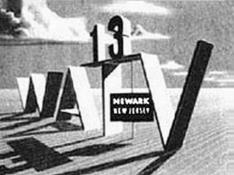
Visuals: On a sky background located at what appears to be the landscape on a farm, we see the letters "WATV" at an oblique angle. Between "T" and "V" is a thin supporting pole with a sign on it that says "NEWARK NEW JERSEY" facing straight at the camera. On top of the "T" is "13" in a bold font.
Variants:
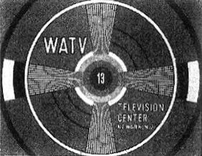
- A variant exists, showing the channel's test pattern.
- Another variant exists in which the background is a skyline (probably New York), the letters are lowercase, a sign with "NEWARK" is on them, and "13" is on the sign and supporting a sign with the text "super power" in the Futura Bold font.
Technique: None.
Audio: Possibly none, although it might have had a voiceover.
Availability: Seen on WATV's first broadcast on May 15, 1948 and on Dove Son Nato.
WNTA
This logo is currently missing in action. Please do not add reconstructions of the logo if any exist, as they are likely not accurate to the actual logo. Additionally, do not attempt to add a finalized description of the logo until it has been found in its entirety. |
Logo (May 7, 1958-December 22, 1961)

Visuals: On a black background, we see the text "WNTA/TV", with a large number "13" seen next to it.
Trivia: Around this time, this was the flagship station for the short-lived NTA Film Network.
Technique: Unknown. Possibly none.
Audio: Unknown. Possibly none or a voiceover.
Availability: Unknown. Seen on old WNET recordings before 1962.
Legacy: In 1962, National Telefilm Associates (later the second incarnation of Republic Pictures) sold this affiliate to the Educational Broadcasting Corporation, where it would be rebranded as WNDT, later WNET.
WNDT
1st Logo (1963)
.png)
Visuals: On a black background, we see a large "13" with the letters "WNDT" below it on the left side. On the right side, we see the text "A PRODUCTION OF", and "EDUCATIONAL BROADCASTING CORPORATION NEW YORK" with "EBC" between them.
Technique: None.
Audio: The closing theme of the show.
Availability: Found on shows on the American Archive of Public Broadcasting.
2nd Logo (September 12, 1968-1971)
.png)

Visuals:
- Opening: On a black background, a large ring made of dark red bars appear one-by-one. They brighten up to orange as a smaller ring made of dark green bars appear by the same effect and the large ring flashes to green. An even smaller ring of bars appears in dark teal. The rings then fade through different colors for about three seconds as a red bar ring slides into view, along with "IN COLOR" below. The rings fade out and the text "PRODUCED IN NEW YORK BY WNDT" appear below in a white Futura font and stacked with each other. "IN COLOR" continues to slide along the bottom of the screen until it goes off screen.
- Closing: On a black background, a winding path of yellow bars appear one by one, followed by a dark red path of bars behind it. They form 3 bar rings, which turn red, green, and yellow respectively, and eventually slide into each other to form a yellow ring. The yellow ring then turns into a red/green/blue ring as the same text in the opening variant appears below, with a copyright reading "©1970 EBC" appearing below. The ring then "spins" through its colors before fading to dark green.
Variants:
- A still variant exists of the closing variant.
- On the Realities episode "Soldiers Who Search and Dissent", this is used as a still in-credit logo, in monochrome. "WNET" replaces "WNDT", and the copyright year is given as 1971.
- A (.*) variant has the text replaced by "PRODUCED IN NEW YORK BY WNET", with the callsign in a larger size, and the copyright for EBC has the name in full. The wheel also doesn't change colors as it cuts to the new end product, and the text zooms out into place.
Technique: Cel animation.
Audio: A funky bongo beat.
Audio Variants: On Soul!, an announcer will either say "Produced in New York by WNDT." or "Soul! was produced in New York by WNDT."
Availability:
- This was used for only a short time before it merged with NET to create WNET (they would also use this logo very briefly).
- It can be seen on the Shout! Factory TV print of the March 5, 1970 episode of Soul! (incorrectly stated to be the first episode of the series) and appears to have been used for the first three seasons thereof. It also appears early on in the documentary Mr. Soul!.
- The in-credit version appeared on occasional episodes of Realities, including "Soldiers Who Search and Dissent".
Legacy: While not much was known about this logo's existence until very recently, Shout! Factory put up the original episodes on their Shout! Factory TV service. Also, the copyright on the bottom of the logo stands for Educational Broadcasting Corporation, the holding company for WNDT; the name existed until 2011, when it was renamed to WNET.org.
WNET Productions
1st Logo (March 1972-Spring 1973)
.png.jpg)
.png.jpg)
Visuals: This is a reworked version of the 13th NET logo, with the logo altered to read "wnet". The animation also appears to be sped up, the mass is completely yellow until it unravels, and a "13" also moves downward from the swirling mass, which causes the word to move up.
Variant: A black & white and possibly filmed variant is seen on Science '72.
Technique: Same as the 13th NET logo, though slightly altered with the design changes that were made.
Audio: Same as the 13th NET logo, but with an additional loop to the keyboard tune, and the announcer says "The following program is from WNET 13." or "The following program is a presentation of WNET 13."
Availability: The logo appeared on An American Family, where it may or may not have been used in tandem with the 3rd logo, and also appeared on Soul!. The alternate announcer variant appeared on Science '72.
2nd Logo (October? 1972-June 27, 1979)


Visuals: On a black background, red rectangles with white horizontal pieces shoot away from the viewer, converging into a red screen with a white “FROM NEW YORK” on it. After a few seconds on screen, the pieces shoot towards the viewer, revealing teal bars, and “WNET” zooms forward on a teal background, with "PRESENTS" appearing below a second later.
Variants:
- A black and white version exists.
- A filmed version exists.
- There exists a version where the background at the end is a maroon color.
Technique: 2D animation.
Audio: A synthesized, keyboard-driven rock tune. The first half of the music has two arrangements: one slightly faster and more hokey-sounding, and the other cleaner and more professional. Both have the same ending.
Availability: It was spotted on pre-1979 recordings of PBS shows produced by WNET.
- It was originally thought to appear on an episode of The Men Who Made the Movies on a DVD directed by the subject of that episode.
- The version with the hokey arrangement appears on a Home Vision VHS of Portraits of an Artist, featuring Georgia O'Keeffe, and at least two episodes of the first season of the PBS incarnation of The Dick Cavett Show.
- The version with the clean arrangement appears on The Great Radio Comedians, the DVD release of The Great American Dream Machine (all episodes on Volumes 1 and 2), and early (pre-1976) episodes of The Robert MacNeil Report, which are available on DVD and online at the American Archive of Public Broadcasting.
- One of its first appearances was on VD Blues in October 1972, while its last appearance was on the seven-part miniseries Women in Art.
- You can also see the complete logo about an hour into the documentary Mr. Soul.
- A few episodes of Theater in America presented on DVD by the Broadway Theatre Archive, such as "Enemies", also preserve this.
3rd Logo (Spring 1973-1975)
.png)
Visuals: An art deco-style "13" that appears to be rotated 90 degrees counterclockwise writes itself on a black screen. The "13" zooms out as a similarly styled "13" that is rotated 90 degrees clockwise writes itself in as a mirror image, overlapping with the "3" in the former "13". Then both of them disappear, as "WNET" written in the same style appears at the bottom and zooms out. A "W" zooms in and out, followed by an "N", an "E", and a "T". Then the background turns red, and "WNET", in white and in a more normal-looking font, zooms in.
Variants:
- A filmed variant appears on the Bill Moyers special An Essay on Watergate
- A short version exists.
Technique: A mix of motion-controlled animation for the first half and Scanimate animation for the second half.
Audio: A clean arrangement of the first half of the previous logo plays, followed by a hokey arrangement of that half with an announcer saying either "Produced in New York by WNET" or "A Presentation of WNET". Afterwards, the second half plays as usual.
Availability: Seen on An American Family, where it may or may not have been used in tandem with the 1st logo. It also appeared on a 16mm print of the Bill Moyers special An Essay on Watergate.
4th Logo (October 6, 1978-May 31, 1985)

.png)
.png)
.png)

Visuals: Two white bars appear from opposite ends of the screen and slide horizontally to the center. After they collide, they retract to reveal "FROM WNET", with "NEW YORK" below. The whole text is in a stylized font. The white bars would do the same for the names of any company, individual, institution, foundation, or organization that funded the program which this precedes (e.g. "Corporation for Public Broadcasting", "Public Television Stations", "The Chubb Group of Insurance Companies", etc.). After the last text slides, the whole thing fades to black.
Variants:
- The color of the background may either be black or blue. The latter is used for the filmed version and also on Great Performances.
- On the Great Performances spin-off Live from Lincoln Center, the first slide after "FROM WNET NEW YORK" reads "Great Performances", and the funding credits announcer also waits a few more seconds to start talking.
- Sometimes, it's superimposed.
- If there are no funding credits at the start of the program, this simply fades in and out.
- On the first season of Nature, one of the last programs to use this logo, the whole thing is set in the Modern No. 20 typeface.
Technique: Simple and unremarkable animation.
Audio: Technically none, except for the voiceover announcing the funding credits, and/or the opening theme of the program. However, if you listen closely, you might hear a test tone towards the end of this logo.
Availability:
- Seen on later episodes of The Dick Cavett Show, as well as on installments of the local late-night movie program Cinema 13 from the era and the 1980 adaptation of Ursula K. Le Guin's The Lathe of Heaven.
- You might also see this on episodes of Great Performances (including Theater in America and Dance in America) and its spinoff, Live from Lincoln Center, as well as on Non-Fiction Television.
- It first appeared on We Interrupt This Week, on which it was superimposed over the opening. Its last appearance was on Love's Labour Lost, broadcast as part of The Shakespeare Plays on May 31, 1985.
5th Logo (December 6, 1982-June 27, 1983)
.png)
Visuals: On a black screen, "WNET" appears as an outline, in a more normal font than before. Below it is "NEW YORK" in the same font as before. Below all that is the logo at the time for their performing arts anthology series Great Performances, depicting, from left to right, a ballerina, a stage actor, an opera singer, and an orchestra conductor standing atop a horizontal, rounded stage.
Technique: None.
Audio: A nine-note synthesized brass fanfare.
Availability: Only seen on episodes of Great Performances from the era, this was a special ident created specifically for the program's 10th season, along with the new opening graphic.
6th Logo (October 9, 1983-September 25, 1989)
.png)
_-_Filmed_Variant.png)
Visuals: On a black background, circular lines showing the New York skyline wipe in, with an outlined “WNET” on it. The pre-2001 World Trade Center "Twin Towers" can also be seen on the far left. As the “radar” circles two more times, the outlined “WNET” becomes more solid, and the morning sky becomes night. Finally, when the sky becomes completely dark, and “WNET” is filled in with white, “FROM” and “NEW YORK” can be seen above and below the letters respectively. The whole thing is in the same font as the 4th logo.
Variant: A filmed version appeared on Heritage: Civilization and the Jews.
Technique: 2D animation.
Audio: A five-note synthesizer tune with chimes, repeating three times, just with different pitches.
Availability: Older tapes of WNET programs should have this.
- Time-Life Video and Lorimar Home Video releases of early episodes of Nature, such as "Forest in the Sea" (where this logo debuted), "Designed for Living" (which was the last episode to use this ID), "Secret Weapons", "Cats", and "Man's Best Friend" (the latter three of which were also made available by PBS Home Video) use this logo.
- You can also see this on episodes of Great Performances and American Masters (which used this logo until 1989) from this era.
- This logo was also seen on a Home Vision tape of New World Visions-American Art and the Metropolitan Museum (1650-1914)-Part Two.
- This logo also followed the 1983-1991 MGM/UA Television logo on The Spencer Tracy Legacy: A Tribute By Katharine Hepburn.
7th Logo (September 9, 1987-January 27th, 1992?)

Visuals: On a blue space background with dancing stars, “FROM” and “NEW YORK” zoom out, along with a "W". Then, an "n", an "E", and a "t" slide out while the animation zooms away from the viewer, all of which resembles the "Thirteen" logo at the time. “Sparks” then create parallelograms to surround “FROM” and “NEW YORK”, placed above and below the logo.
Variants:
- An in-credit version appears at the end of 1986-1991 episodes of American Masters. The logo has "A PRESENTATION OF" above the logo and "NEW YORK" either appears in the bottom parallelogram or is under it, leaving either the top or both blank. There may be a copyright notice below.
- In a rare exception to the general rule that station logos don't appear on co-productions between PBS stations, this and the KCET logo are played simultaneously, without any music, before Television.
- On some programs, including Shining Time Station, the logo is slightly sped up to 30fps (the logo was originally animated at 24fps) and the audio is out of proportion, or vice-versa.
Technique: CGI.
Audio: Same as the last logo.
Availability:
- This logo is easier to find than the previous logo, given the fact that it has appeared on PBS Home Video tapes of the era from WNET, including episodes of Nature and Great Performances, and even plastered the previous logo on some Time-Life releases of the former.
- Its first appearances were on The Power of Choice and I Would Be Called John: Pope John XXIII, as well as on sixth-season episodes of Nature and the 1987 rebroadcast of The Adams Chronicles.
- Both first and second season Shining Time Station episodes (the first season being when Ringo Starr was Mr. Conductor and the second season with George Carlin as Mr. Conductor) have this logo, too. Depending on your PBS station, it was seen either at the beginning or end of an episode.
- It also appeared on the Laserdisc releases of the Nature episode "The Volcano Watchers" and the American Masters episode "A. Einstein: How I See the World". It is unknown if this appears on any DVD releases.
8th Logo (February 9?, 1992-October 23, 1999)
.png)
Visuals: On a black background, we see “wnet” in a thin font in a black rectangle with the word carved out of it, and “NEW YORK” appearing letter-by-letter, circling the logo counterclockwise while a spotlight shines around the logo from right to left.
Trivia: This is a live-action logo, created by Liberty Studios (which also produced HBO's "In Space" opening from 1982) in 1991 and directed by Robert Lyons and David Bruce. An Oxberry Animation Stand Camera was used for the filming of this logo, which like the 1992 PBS logo, was shot on 35mm film.
Variant: Sometimes, the logo is referred as "FROM wnet NEW YORK".
Technique: Live-action.
Audio: A beatbox jingle with a synthesized choir sounder.
Audio Variant: Sometimes, announcer Tom Stuart will say, "A production of WNET New York" over the jingle. This can be seen on American Masters.
Availability: In its day, it appeared on Nature, American Masters, Charlie Rose and the pilot episode of Cyberchase (one of the last appearances of this logo). Also appeared at the beginning or end of season 3 episodes of Shining Time Station. It may appear on early DVD releases of Nature. It also appears on the PC game The Day the World Broke.
Thirteen (WNET New York)
1st Logo (October 24, 1999-October 31, 2006)
_2020817_203215.png)

Visuals: On a dodger blue background with many flashing dots (apparently arranged to look like skyscrapers), a pulse “wipes” inside the words “thirteen” with a red dot on the "I" (placed on the background as to be placed on one of the "dotscrapers" as if an antenna), and the words “WNET NEW YORK” fade in below.
Variants:
- One version has flashing dots covering the horizontal middle of the screen.
- Another one is on a red background with dots moving towards and away from the red dot on "thirteen".
Technique: 2D animation.
Audio: A five-note digital piano sounder. The variant has jazz piano and drum music. However, you can also hear the closing theme of a particular show over this logo (like Cyberchase, for example).
Availability: Can currently be seen on Cyberchase releases on VHS and DVD and most reruns on PBS. Also appeared on 1999-2006 episodes of Nature and Charlie Rose. Also seen at the end of American Masters and The Face - Jesus in Art. Even though it officially ended use in 2004, it was used as a placeholder for the next logo until 2006.
2nd Logo (October 31, 2006-March 27, 2015)
_20200817_203510.png)
Visuals: There is an overhead view of New York City, with the "thirteen" from the previous logo, rendered in CGI, floating overhead. The camera pans down to a 20th Century Fox-esque angle (except it's reversed), so we see the logo from below.
Variants:
- On Make Em' Laugh, the logo is slightly sped up. After it finishes, a hand with a yellow shirt bounces the red dot off the "I".
- US prints of Franny's Feet and Wishbone have the first second cut off.
Technique: CGI.
Audio: A held-out bass violin note, followed by a soft 5-note piano sounder with violas at the end. Sometimes it has the closing theme playing over it.
Audio Variant: On Make Em' Laugh, we hear a "clinking" sound when the hand bounces the dot off.
Availability:
- Seen on Nature, Charlie Rose, Barney & Friends, Cyberchase and NOW, among others.
- Usually replaced with the 2009 logo, but this is still abound on most shows of the era such as reruns of Sprout's Franny's Feet.
- It also appears at the start and end of recent prints of the 1976 miniseries The Adams Chronicles, accompanied by, surprisingly enough, the 1984 PBS ID (this plasters the 1987 logo from the Fall 1987 reruns).
- Even after it officially ended in 2009, this continued to appear on Charlie Rose's programs for some time after, with Charlie Rose: The Week using it until March 27, 2015.
- This can also be seen on some reruns of Cyberchase.
3rd Logo (April 19, 2019-May 8, 2020)
.png)
Visuals: On a nightime New York skyline, we see a billboard reading "A PRODUCTION OF THIRTEEN" (with "A PRODUCTION OF" in red and "THIRTEEN" in yellow, stacked atop each other) atop a brownish building. The camera then pans down to a 20th Century Studios-like angle. The logo then fades out.
Technique: CGI.
Audio: A Mexican guitar tune, which came from a stock library.
Availability: Some claim that it appeared on Season 12 of Cyberchase, but most airings of said season use the normal logo. It's possible that this logo is exclusive to the WNET station.
WNET.ORG THiRTEEN
Background
WNET.ORG is the name of the organization that holds the licenses of WNET and its sister station on Long Island, WLIW.
Logo (May 13, 2009-March 27, 2022)
-

-

-

-

-

The Angelina Ballerina variant.


.png)

Visuals:
- May 13, 2009-February 21, 2010: We see the skyline of Manhattan at night. A line draws itself next to the moon, and spins several times and stops by forming a lowercase "i". "TH" slides out of the left side of the "I" and "RTEEN" slides out of the right side of the "I": all in the Gotham typeface. After the animation is done, "WNET.ORG" appears above "THIRTEEN".
- February 22, 2010-2012: "WNET.ORG" is there before "THIRTEEN". There's also a different background, with the Empire State Building.
- 2012-2022: Instead of "WNET.ORG", only "WNET" appears. As a result, the "i" animation is no longer used.
Variants:
- On Worldfocus, Firing Line with Margaret Hoover, and PBS Newshour Weekend, "CREATIVE NEWS GROUP" appears in place of "THIRTEEN".
- Sometimes, or as seen on episodes of Live from Lincoln Center, The text "WNET" was shown, and the text "THIRTEEN" doesn't appear at all.
- On WLIW-produced programs, such as Front and Center, "WLIW21" appears in place of "THIRTEEN".
- On Sprout prints of Angelina Ballerina: The Next Steps, two reported variants exist:
- one where only the text "THIRTEEN" was shown and there is no "WNET.ORG" at all,
- and one where there is no text at all and only has the footage of the Empire State Building.
Technique: Live action, with motion-controlled animation for the text.
Audio:
- May 13, 2009-February 21, 2010: A re-orchestration of the 2006 logo's theme was used a few times.
- 2009-2022: A gracious 4-note orchestra tune composed by Niccolo Athens. Sometimes extended with a piano note at the end.
Audio Trivia: You can watch a video of Athens conducting this logo's theme, as well as other themes used in WNET's local bumpers of the time.
Availability: This logo still appears on most new programs, mainly in prime time.
- Can be seen on American Masters, Tavis Smiley, PBS News Hour Weekend, Nature, Great Performances, Charlie Rose, Charlie Rose: The Week (though no logo appears at all on most editions beginning December 18, 2015), and Cyberchase.
- The original variant made its last appearance on a rebroadcast of the Nature episode "Invasion of the Giant Pythons".
- Also shown up on Los Angeles-animated Bob the Builder: Ready, Steady, Build and Angelina Ballerina: The Next Steps, (animated in Taiwan) and PBS airings of Barney & Friends and Thomas and Friends (DVDs and Sprout airings remove this logo; also, on PBS airings of the former, the logo appears after the HiT logo instead of before it, since no other company, not even Nitrogen Studios, produced it).
- Its last appearance was on the March 27, 2022 edition of PBS NewsHour Weekend, which was also its last to be produced before moving to WETA.
The WNET Group
Logo (May 14, 2021-)

.jpeg)
Visuals: On a white background with dots below, we see the words "WNET", "The", and "Group", being scattered across the screen. Afterward, the logo moves to the center with the text moving to a yellow line. A thin line forms by WNET group, and the text, "Media Made Possible By All Of You".
Technique: 2D animation.
Audio: A five-note synth tune.
Audio Variant: On Part 2 of the Nature special miniseries Growing Up in the Rockies, silence.
Availability: First seen on the May 14, 2021, edition of Firing Line. It also appears on Tulsa: The Fire and the Forgotten. Since July 9, 2021, it has also appeared on Great Performances, and since July 27, 2021, on American Masters; by the fall of that year, most WNET programming had switched over to this logo, an exception being PBS NewsHour Weekend, which continued to use the 2009 logo until it was rebranded and moved to WETA. It also appears on season 13 of Cyberchase, making it the third season 13 of a WNET kids show to use a new WNET logo.