


- 6 Point Harness
- 70/30 Productions
- All Seasons Entertainment
- Amity Entertainment
- Anime Crash
- AnimEigo
- Augenblick Studios
- Bakshi Productions, Inc.
- Bang Zoom! Entertainment
- Benny Smart
- Beverly Hills Film Corporation
- Blue Streak
- Bokabi
- Brentwood Kids Company
- Build-a-Bear Workshop Entertainment
- Calico Entertainment
- Callaway Arts & Entertainment
- Central Park Media
- Chris D'Angelo Productions
- Cinematico
- Cloudco Entertainment
- Cloverway, Inc.
- Creative Capers Entertainment
- DAM
- Darby Pop Productions
- Dark Horse Entertainment
- Dave Hood Entertainment
- Feature Films for Families
- Forest City Rockers
- GKIDS
- Ginormous Madman
- Grantray-Lawrence Animation
- Graz Entertainment
- Green Light Media
- Hammer Creative
- Harringtoons Productions
- Hentemann Films
- Imagination Factory Inc.
- The Ink Tank
- Jambalaya Studio
- Jay Ward Productions
- John Sutherland Productions
- Judgemental Films
- JWL Entertainment Productions
- Kid Time Video
- Kideo Incorporated
- KidRo Productions
- Kids' Media Group
- The Krislin Company
- Lil' Whoop Productions
- Lisberger Studios
- Little Airplane Productions
- Lucky Duck Productions
- The Magic Store
- Magnetic Dreams
- Marc Brown Studios
- MarshMedia
- Media Blasters
- Meridian Education Corporation
- MGA Entertainment
- Mirage Studios
- Modern Cartoons
- Moxie Turtle
- Mulberry Square Productions
- NCircle Entertainment
- O Entertainment
- PMT, Ltd.
- Paper Kite Productions
- Paul & Joe Productions
- Perez-Minton Productions
- Perky Pickle Studios
- Phil Nibbelink Productions
- Pirates World Pictures
- Polka Dot Pictures
- PorchLight Entertainment
- Puny
- Rabbit Ears Storybook Classics
- RKO Cartoons
- Sabella Dern Entertainment
- Sachs Family Entertainment
- Shadow Projects
- Sirius Thinking Ltd.
- Slam Dunk Productions
- Spark Plug Entertainment
- Star Anime Enterprises
- Star Farm Productions
- Stephen Bosustow Productions
- Streamline Pictures
- Stretch Films
- Summertime Entertainment
- Synch-Point
- TM Books and Video
- Tadpole Kids
- Titmouse, Inc.
- Topps Animation
- Topstone Productions
- The Tornante Company
- United Media Productions
- Urban Vision
- Vitello Productions
- (W)Holesome Products
- Wild Canary Animation
- Wolf Tracer Studios
- Wonderwings.com Entertainment
- World Leaders Entertainment
- YES! Entertainment
- Young Generation Video
Warner Bros. Feature Animation
From the Audiovisual Identity Database, the motion graphics museum
Descriptions by
Supermarty-o and WileE2005
Captures by
Logoboy95 and Supermarty-o
Editions by
StephenCezar15
Supermarty-o and WileE2005
Captures by
Logoboy95 and Supermarty-o
Editions by
StephenCezar15
Background
In 1994, Warner Bros. Pictures started a feature animation division after the success of Disney's The Lion King. Space Jam was the first film produced by the studio, and was a box office success, despite mixed reviews. Their second feature, Quest for Camelot, was a critical and commercial failure, the first of many. Their third, The Iron Giant, received positive reviews but was a box office bomb due to a rushed marketing campaign; it has since received a second life thanks to video/DVD and TV showings and is now considered a classic.
After the critical and commercial failures of Osmosis Jones and Looney Tunes: Back in Action, Warner Bros. decided to close the studio in 2004, with much of the staff being integrated into the Television Animation division; several of their later animated films were animated by other companies (such as The Polar Express and the Happy Feet films). In 2013, the studio was re-established as the Warner Animation Group (now Warner Bros. Pictures Animation).
(August 6, 1999)
-

Scope variant
-

Pan-and-scan open-matte variant
-
Prototype version from a trailer for The Iron Giant
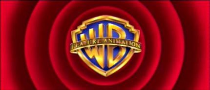
Logo: On a black background, a bannerless WB shield slowly zooms in. In the background, we reveal the red Looney Tunes rings (as in the Warner Bros. Cartoons logo) as a gold banner with "FEATURE ANIMATION" displayed on it fades in over the shield. The byline "A TIME WARNER ENTERTAINMENT COMPANY" fades in below, then the rings disappear as the shield turns dark and fades away.
Trivia: The Iron Giant was originally going to open with the Warner Bros. Family Entertainment logo, but director Brad Bird was against the idea, feeling it didn't set the proper tone for the film. The studio initially denied Bird's request to create a custom logo for the film, but about a month before the film's release, they gave him permission to do so. According to Bird, "[The team] thought it was a much cooler way to make a nod at a famous animation heritage but to do it in a much classier way."[1]
Variants:
- On pan-and-scan prints of The Iron Giant, the logo is open-matte.
- On a trailer for The Iron Giant, a prototype version was used, which had the shield zooming in faster than the final version. This variant is bylineless as well.
Technique: 2D computer animation.
Music/Sounds: Only the opening ambience to The Iron Giant: a Sputnik-like beeping sound.
Music/Sounds Variant: The prototype version had the opening theme of the trailer.
Availability: Rare. Seen only on The Iron Giant.